Rebranding Nortada. A Portuguese Craft Beer.
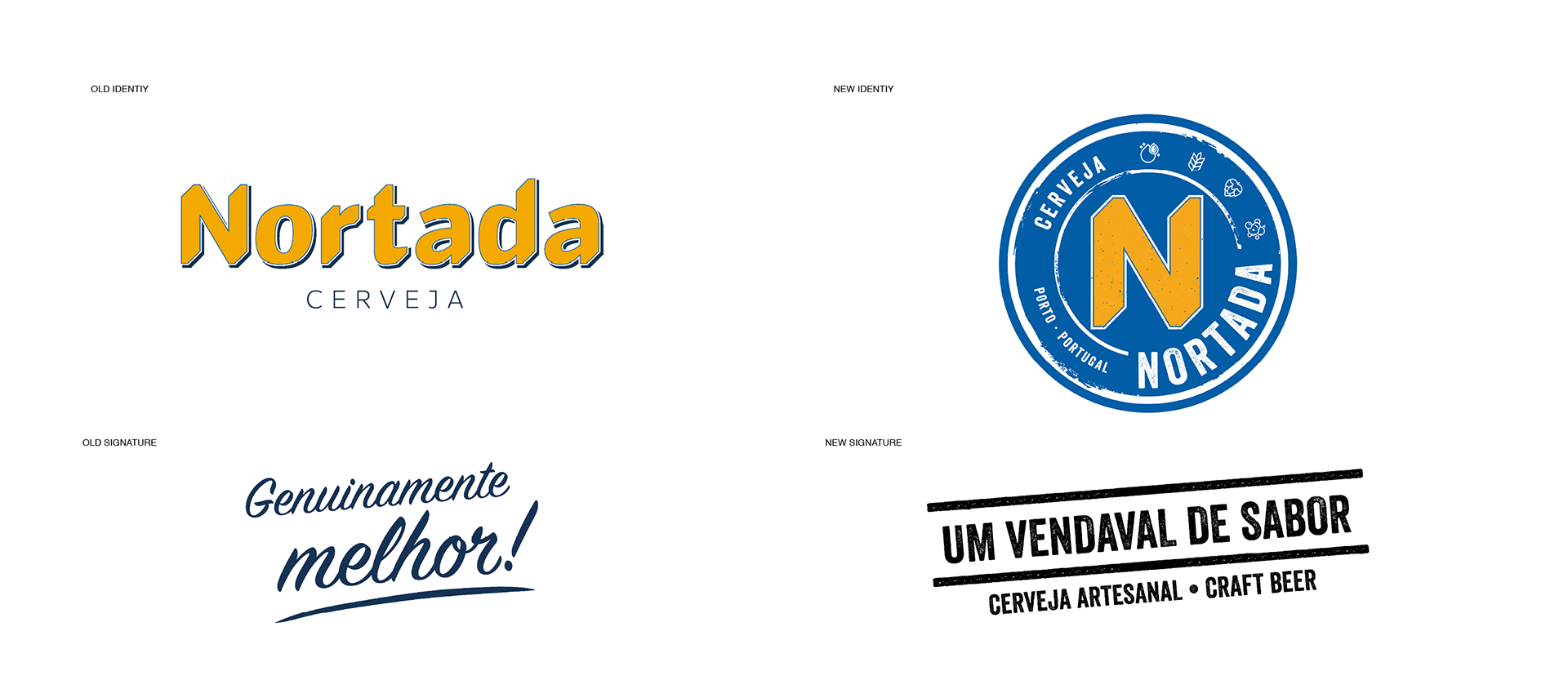
Launched in April 2007, it didn’t take long for Nortada’s marketing team to recognise that the brands visual aesthetic didn’t create a great impact on their target audience and needed an innovative approach that gave it an appealing look that would engage the younger generation of beer lovers. Developed by Cerveja Nortada in-house creative team, the focus of the rebranding was to truly reflected the brand’s core attributes (Superior Quality, Beer culture and Regional Pride) and its fun and youthful personality, while maintaining some connection with the past.
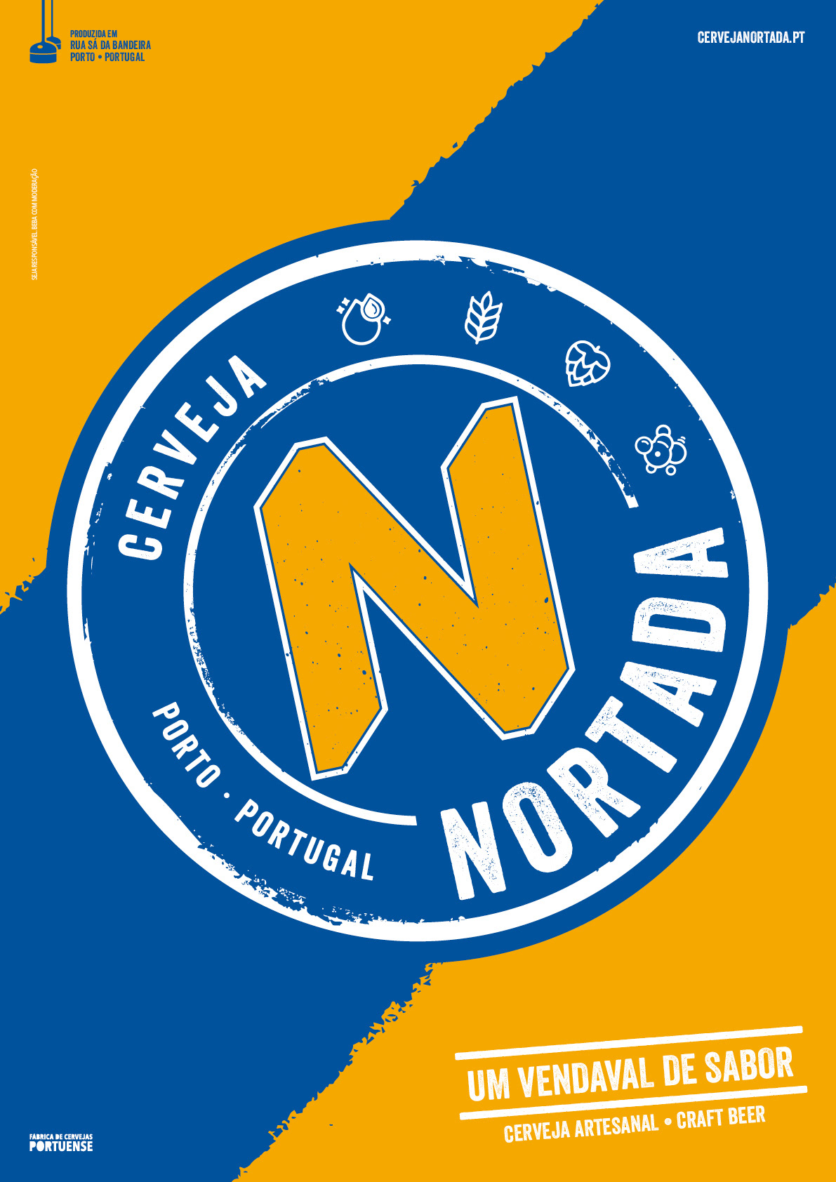
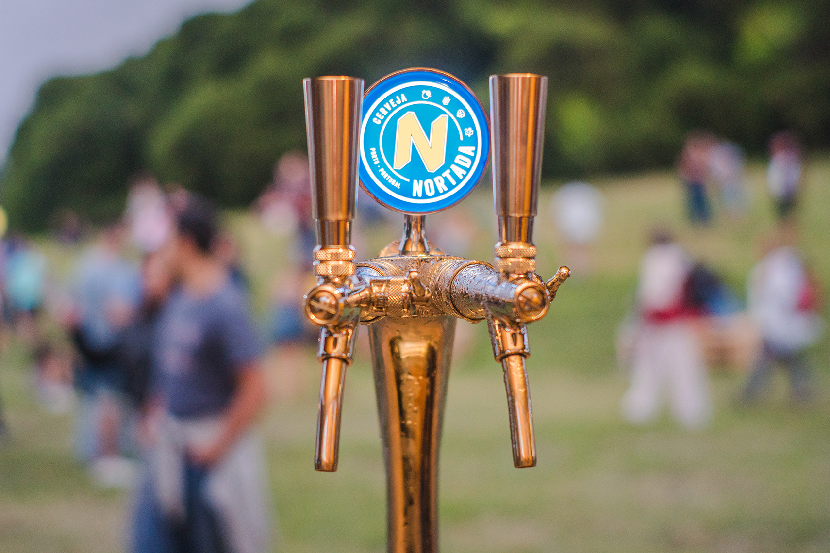
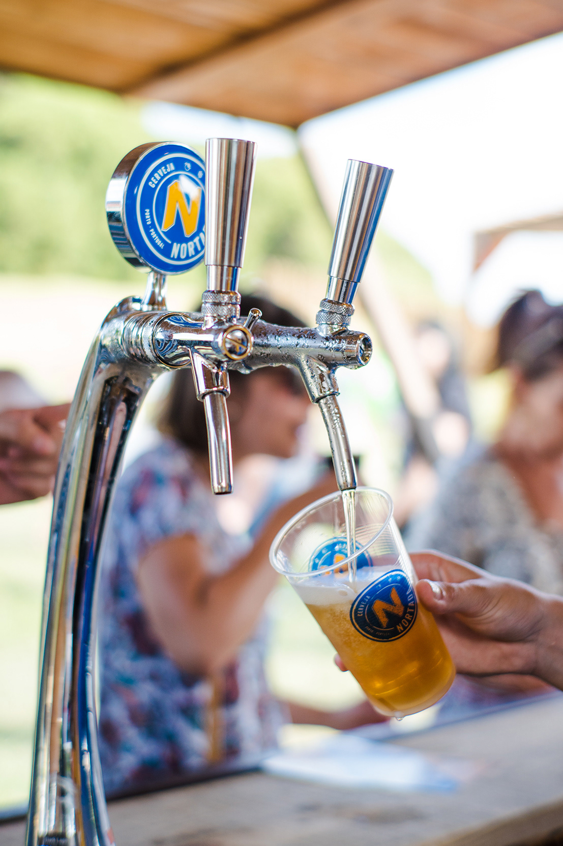
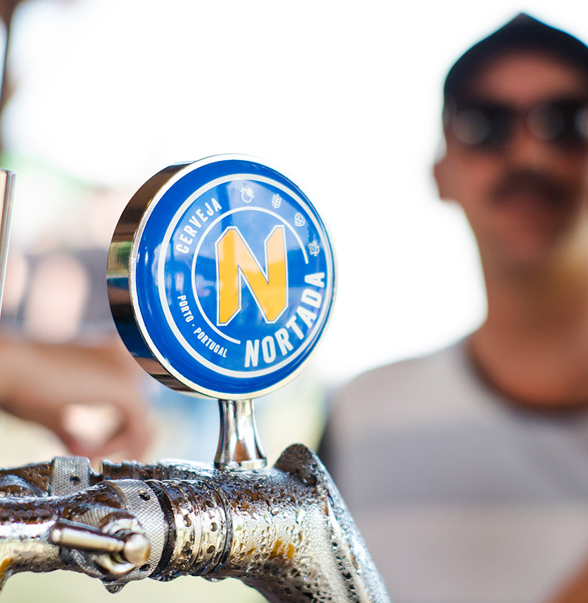
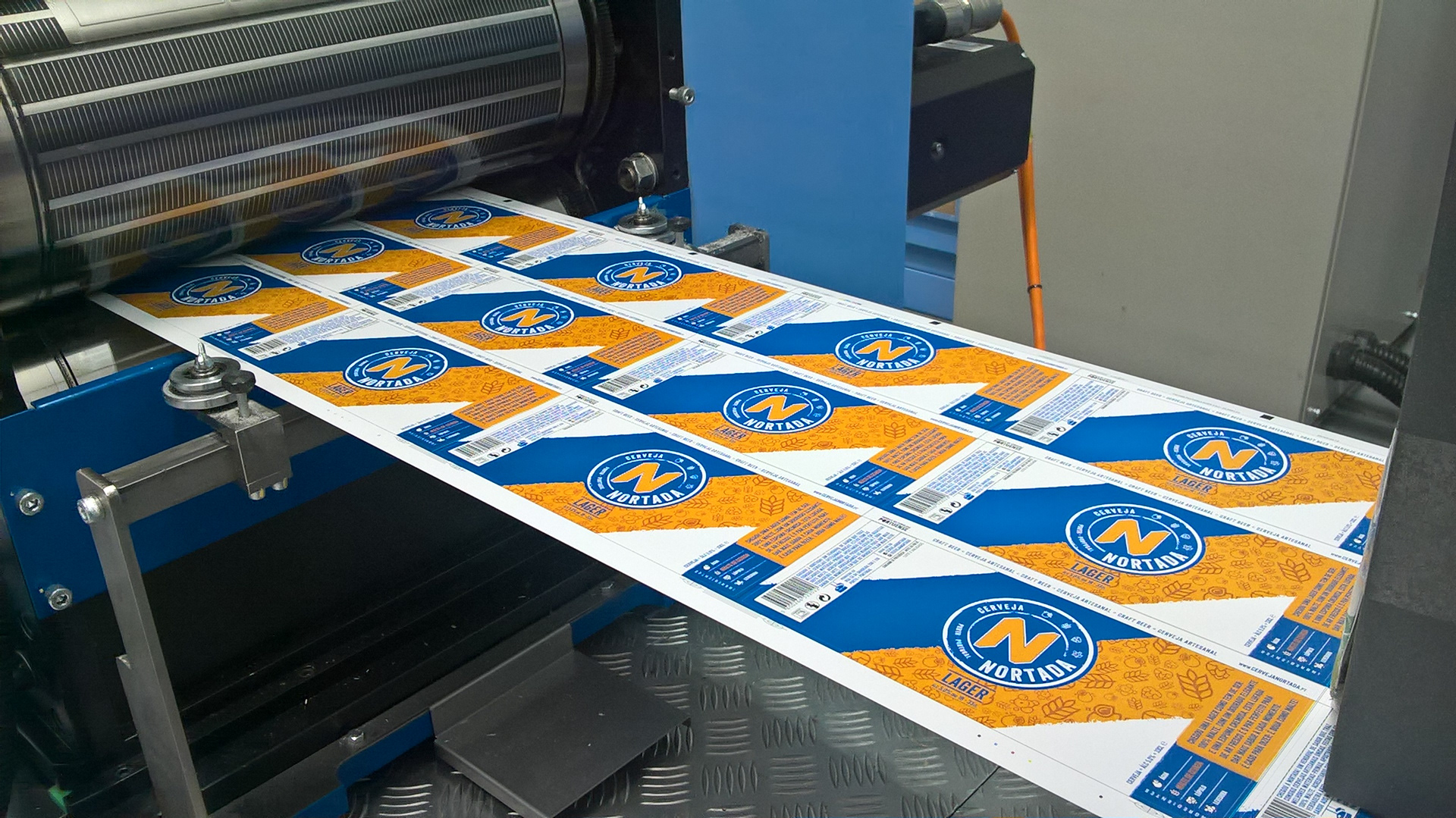
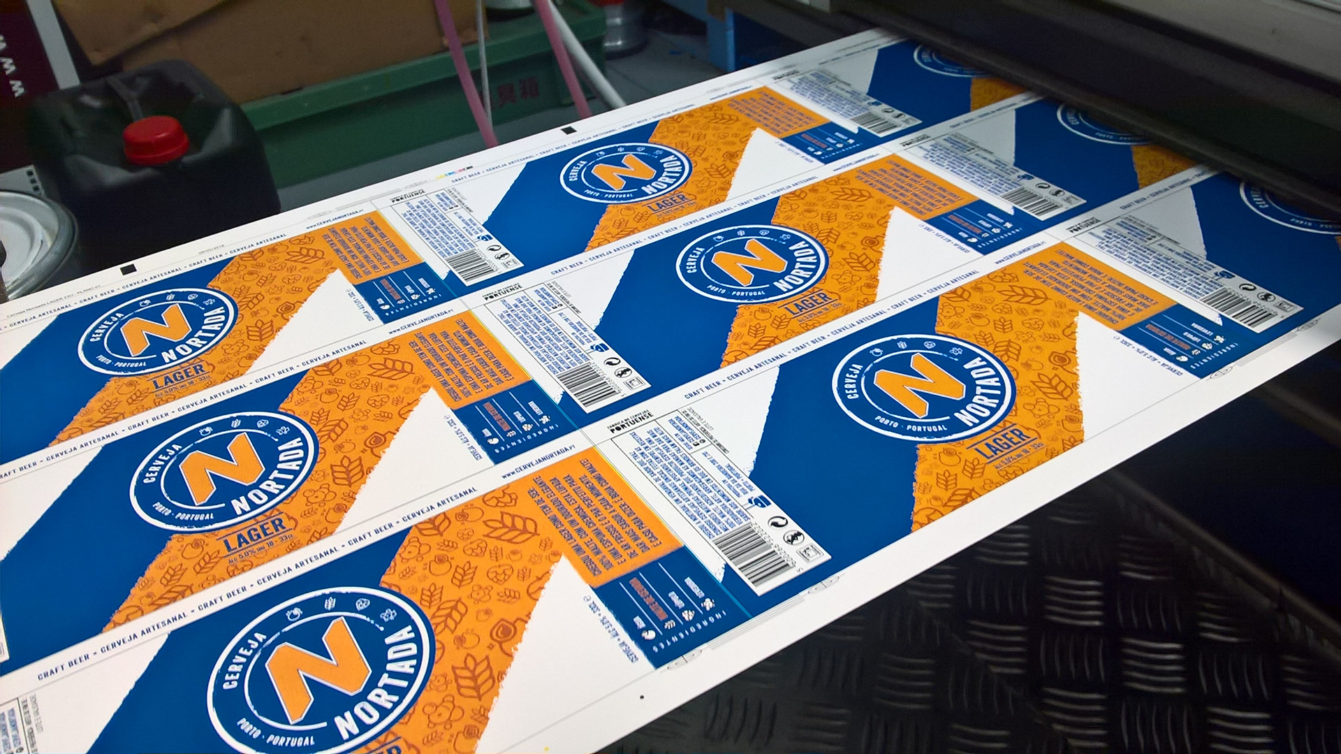
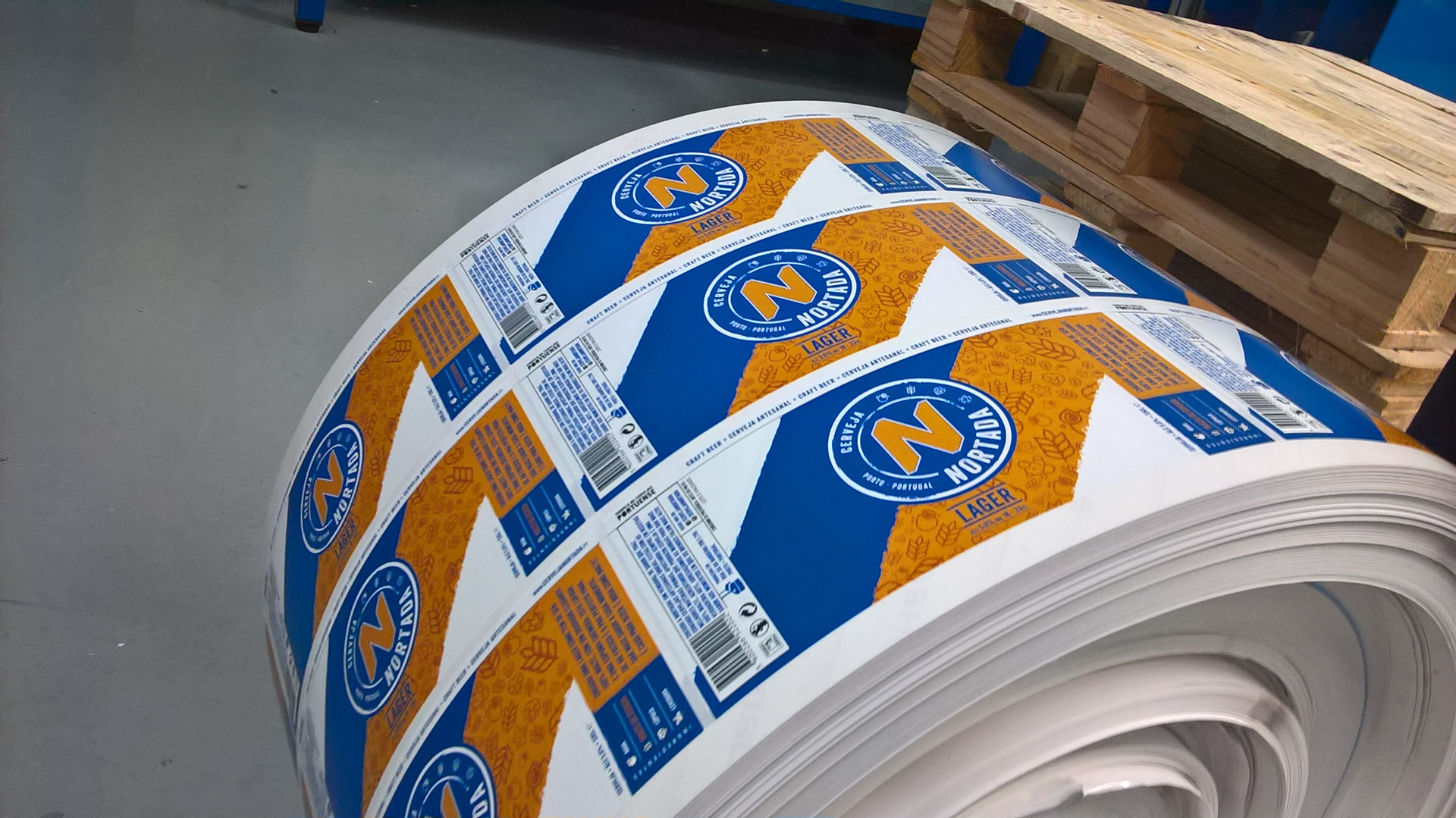
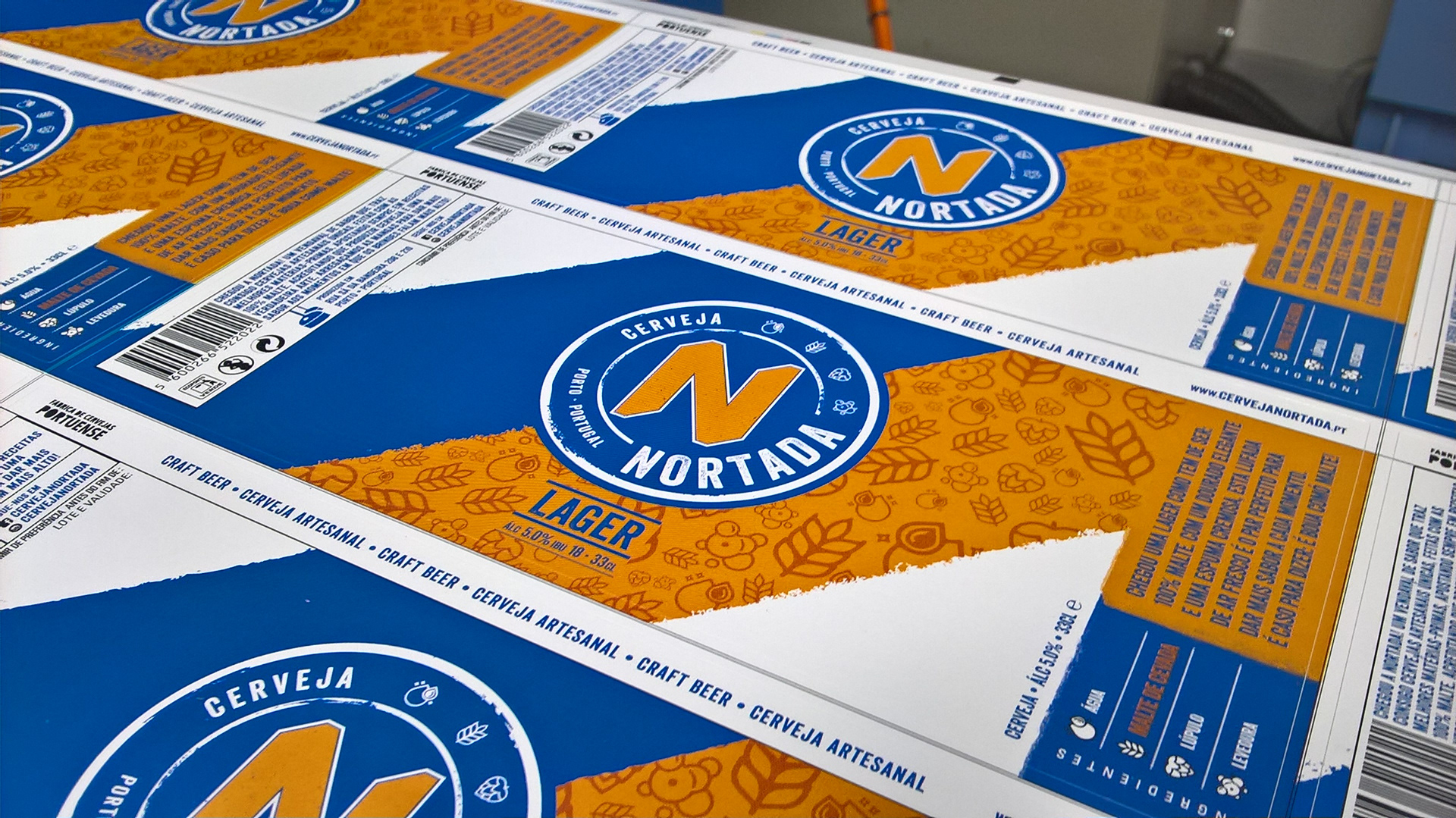
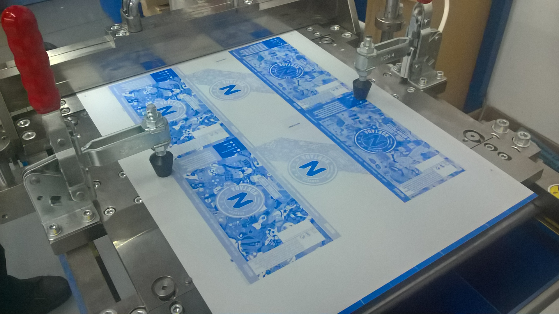
The process began with the development of a new brand identity, “The Stamp”. This element was created to give the brand a contemporary and aesthetically pleasing identity that was aligned with the rebranding objectives: the iconic “N” was enhanced to connect the past to the present; the iconography of the four key ingredients was included as a way to reinforce Superior Quality and Beer culture; and special emphasis was given to the origin of the product (“Porto. Portugal) as a way to support the brand’s pride on offering locally produced beer. The choice of a round shape came about to guarantee great visual consistency throughout all product packaging and communication, as it could easily be implemented on any material.
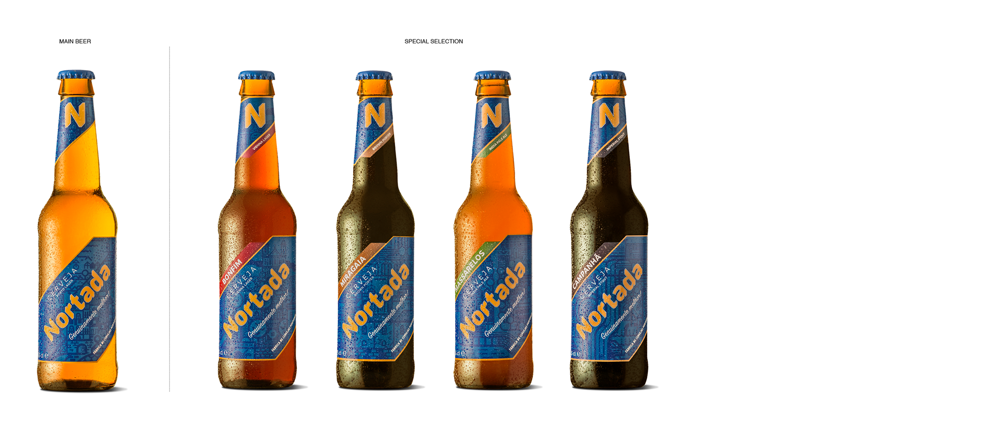
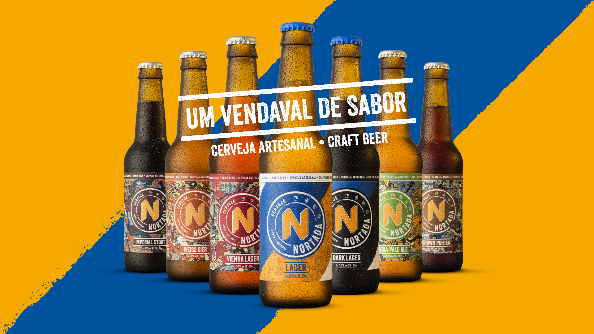
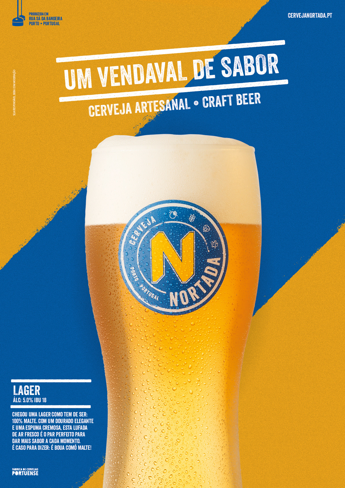
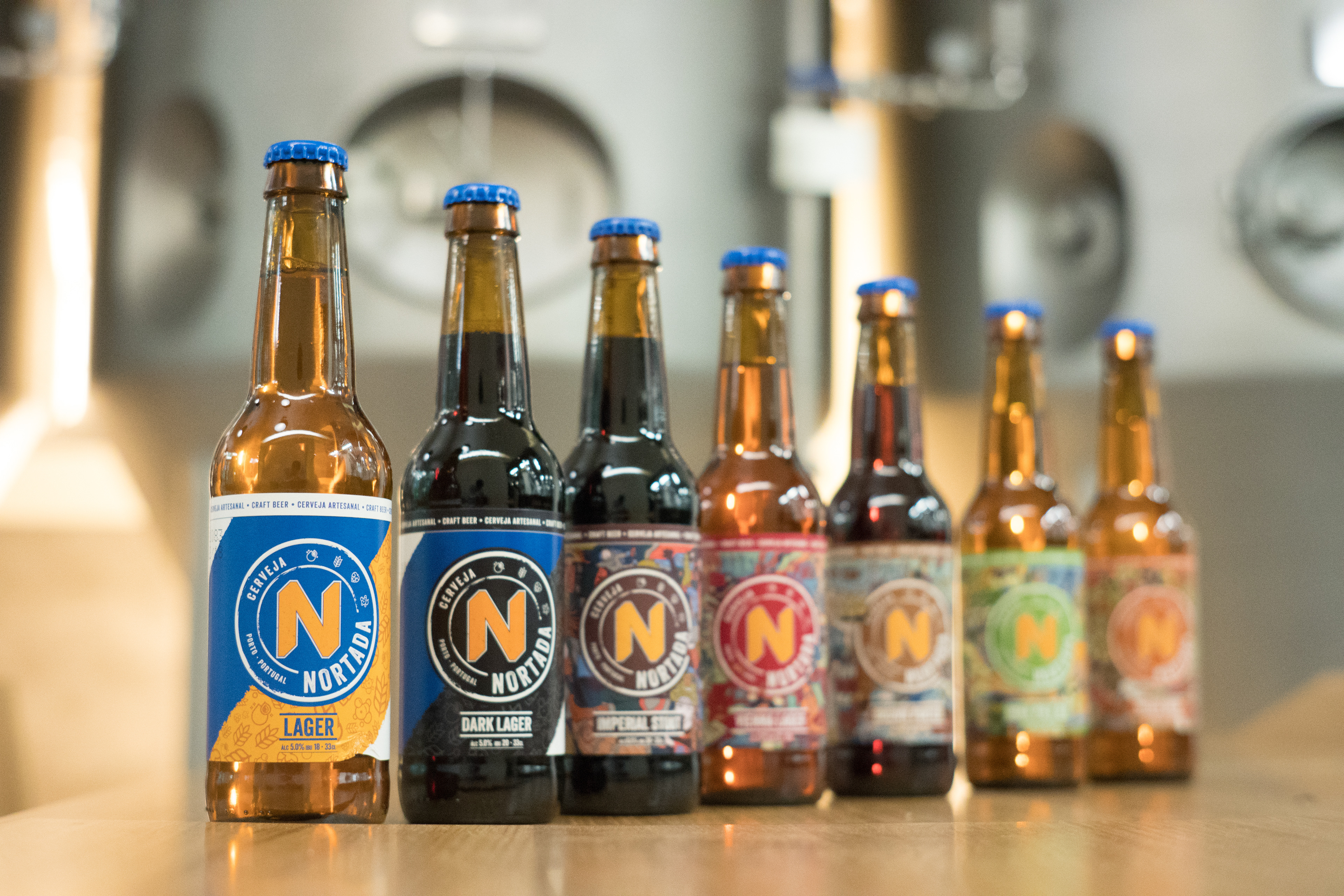
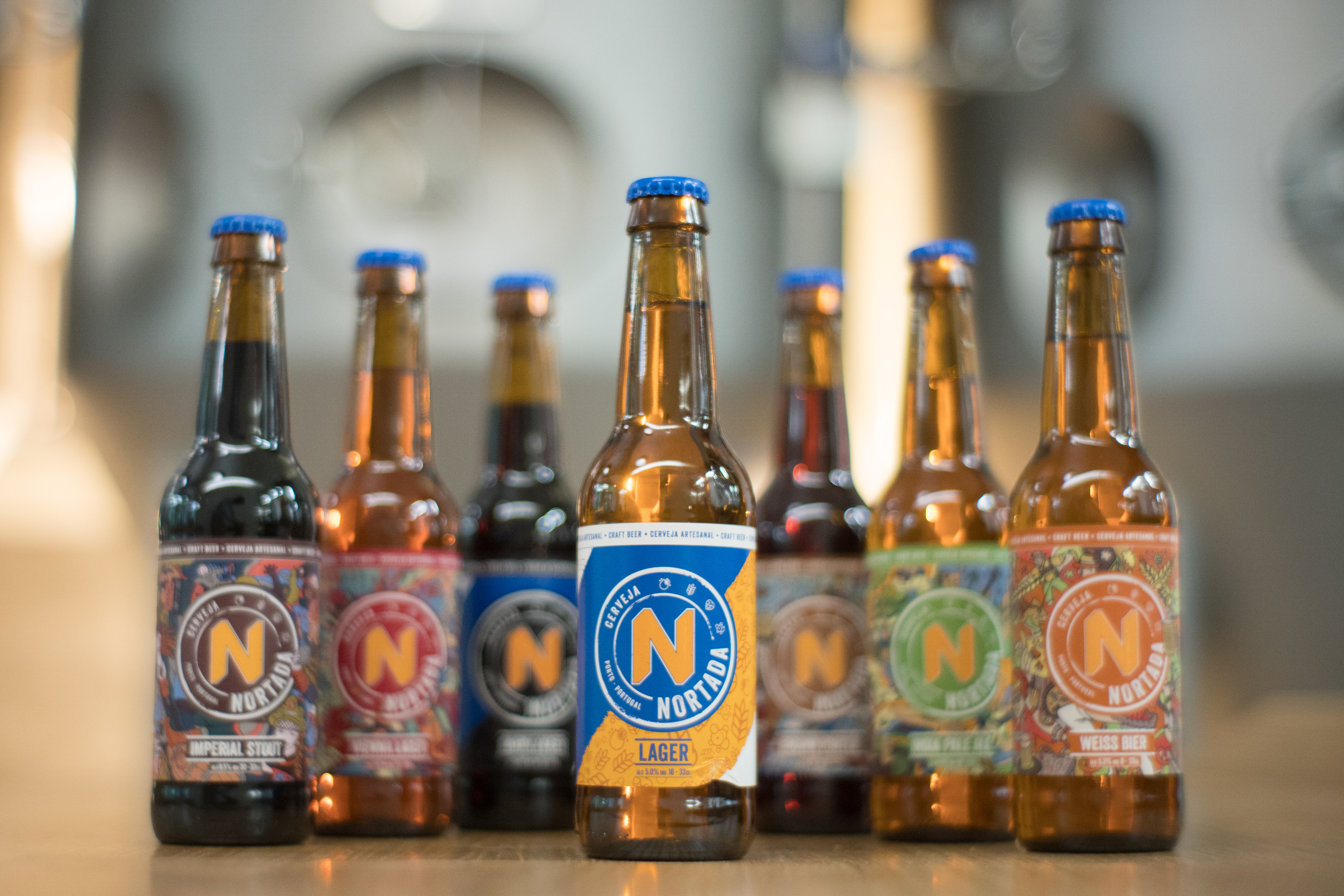
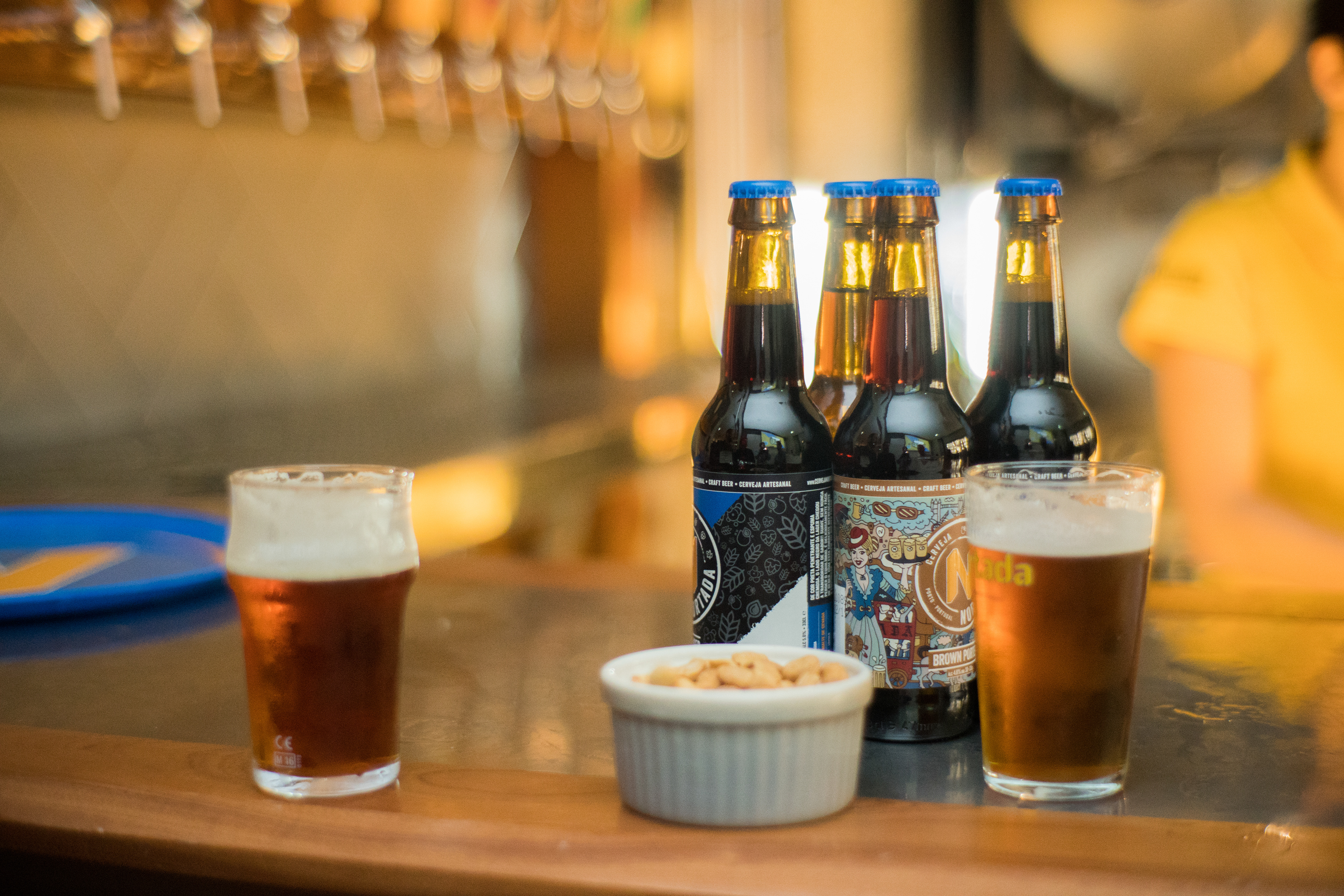
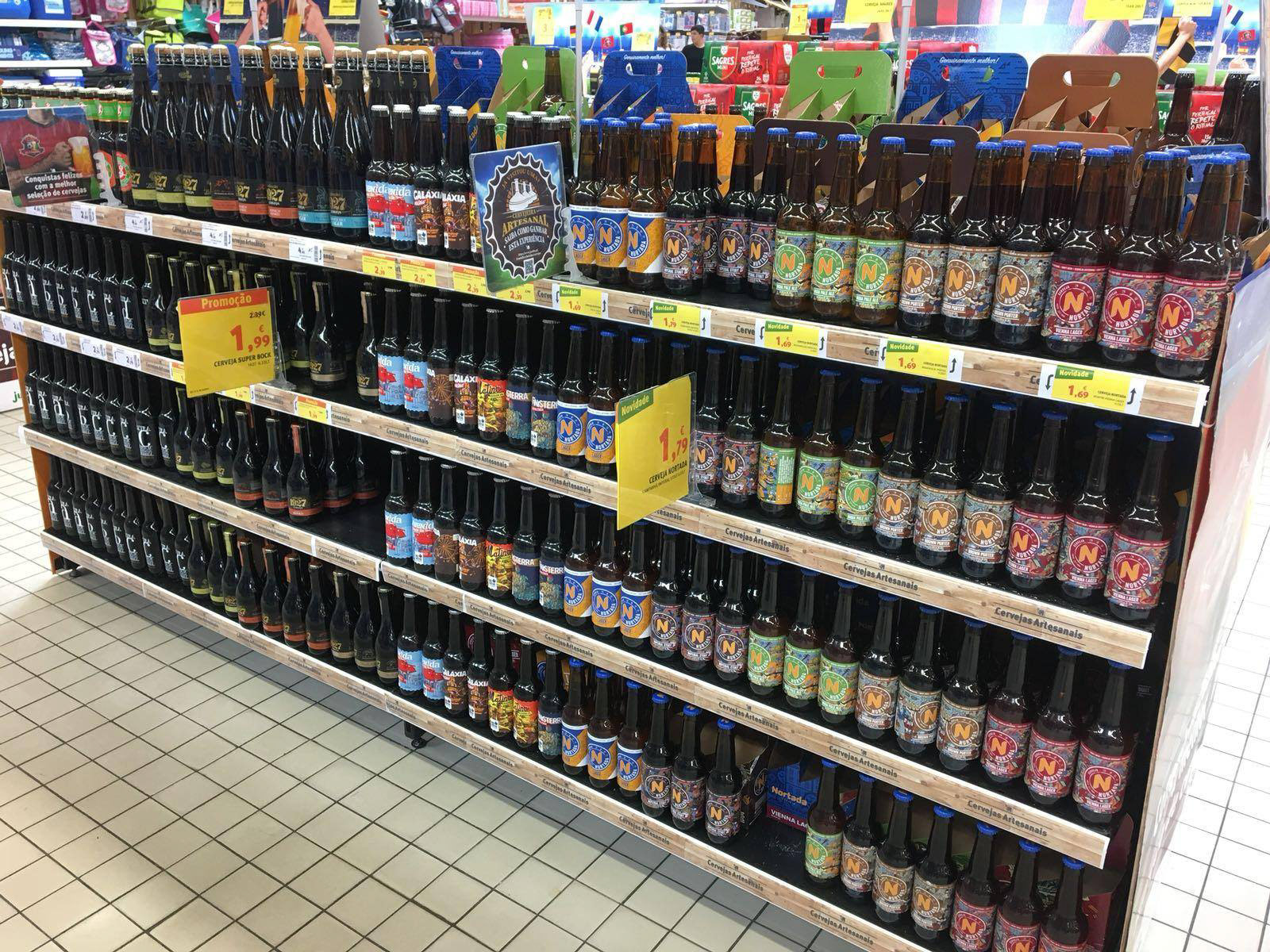
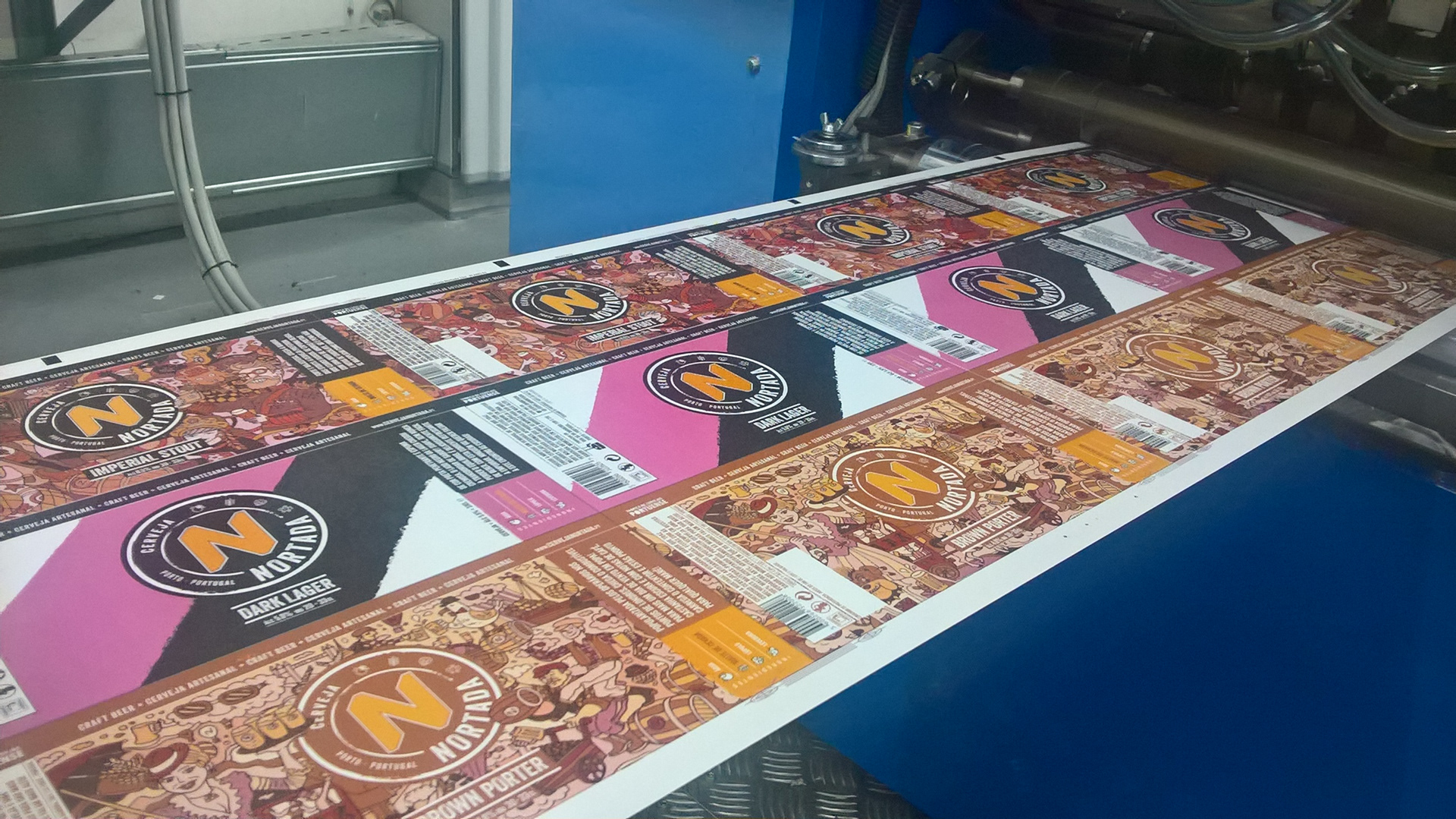
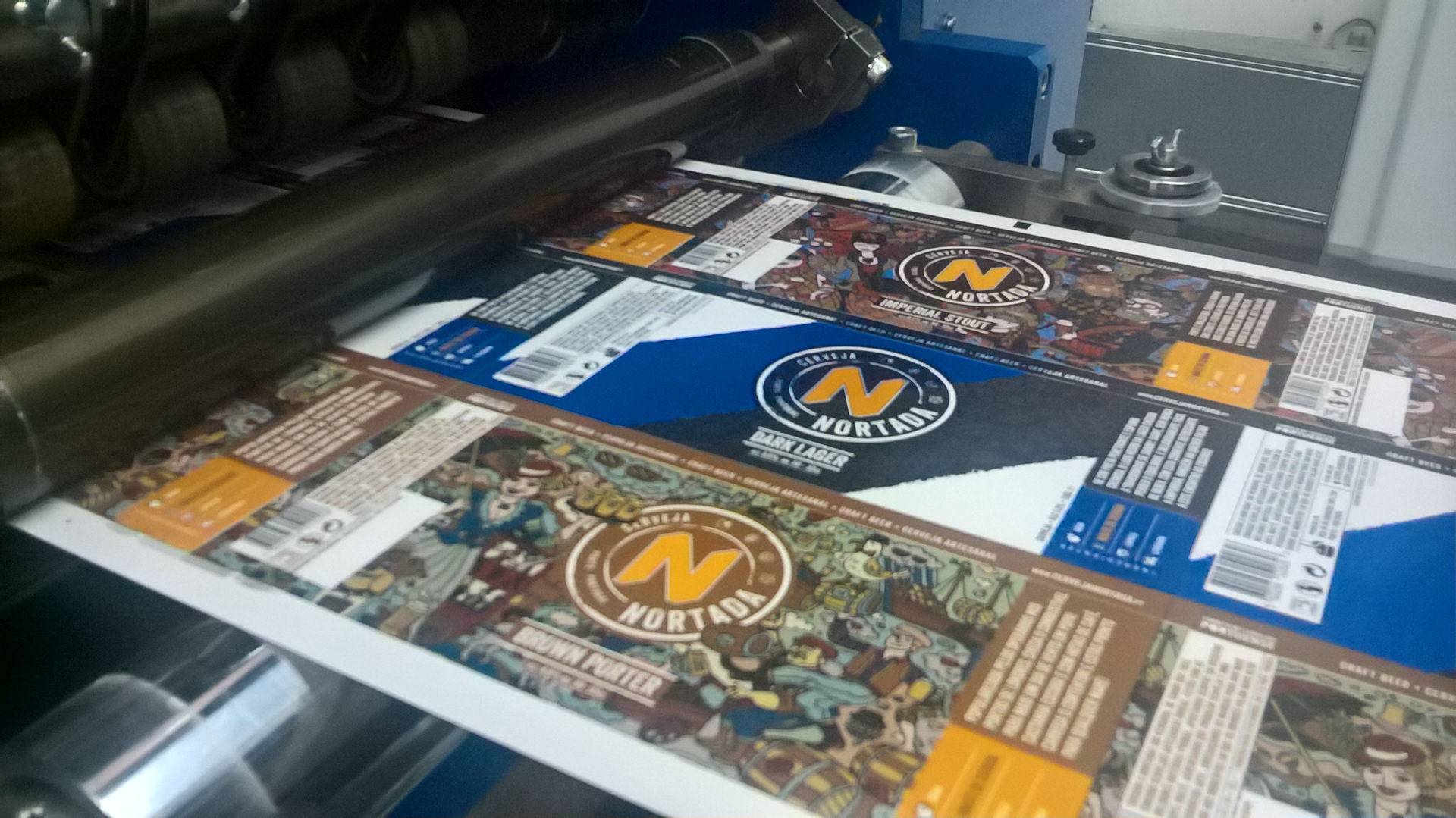
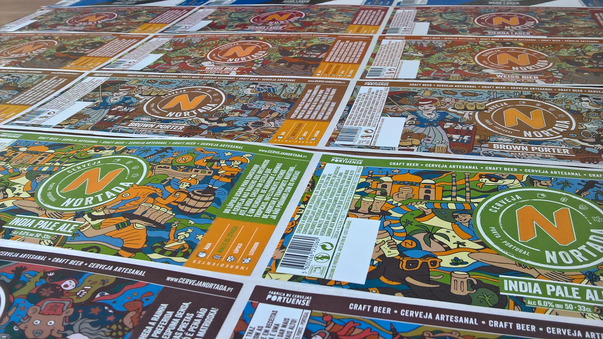
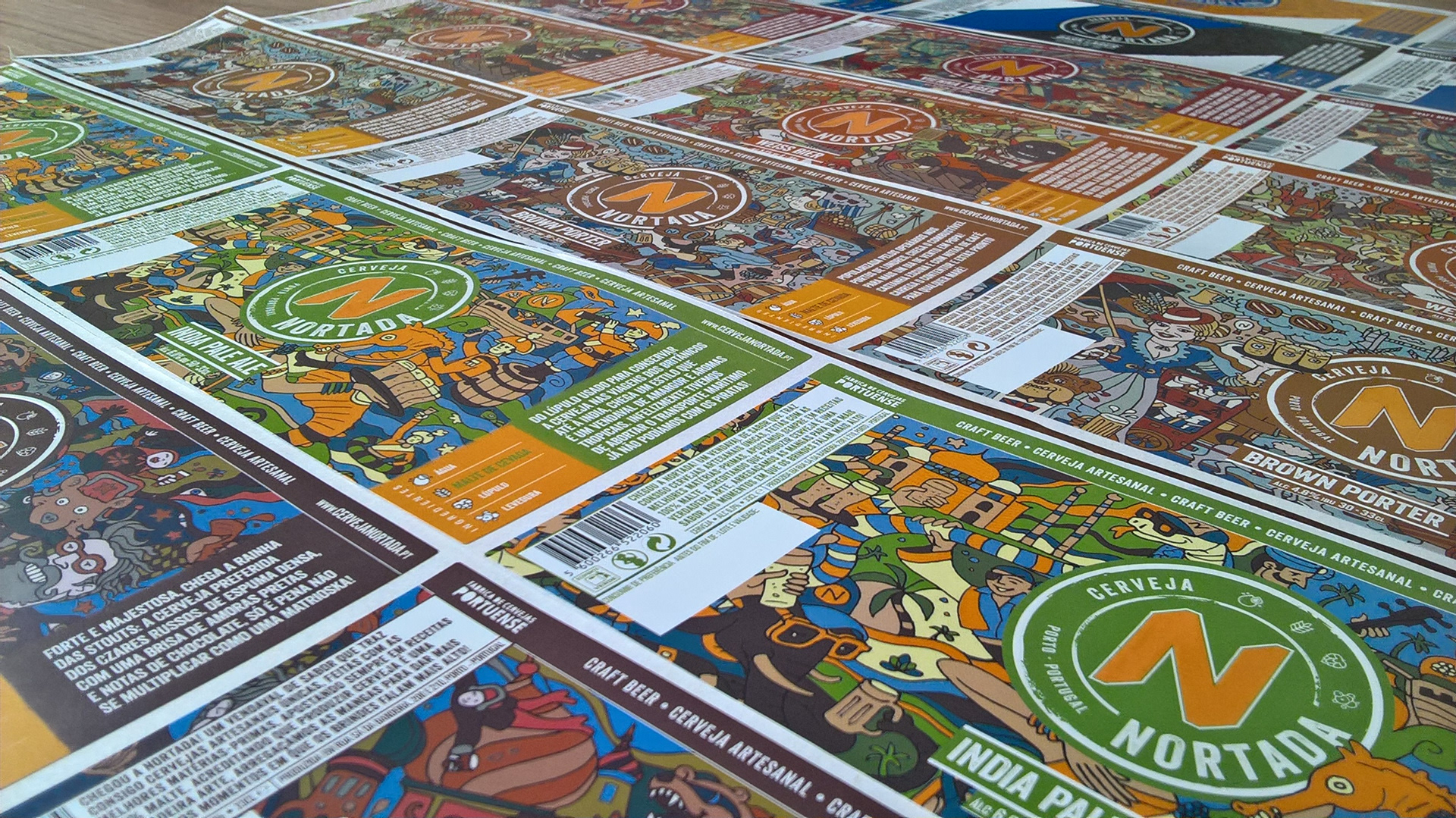
Looking into the label design, the brand’s new strategy for it’s 7 products was to create a clear distinction between two groups: two beers with a lower price point and five premium styles with higher price point. The challenge was to create two distinct visual approaches while maintaining a high level of consistency throughout the portfolio. This was achieved by applying a diverse approach for the background composition of each set of products while keeping the Stamp as the key element. For the first group, the diagonal strips were brought to life, with the blue one working as a connection to the brand’s main colour, while the other highlights the ingredients that were used to brew these delicious beers; For the more premium set of beers, a more refined look was created. Since all styles are iconic beer styles, each styles historical background was brought to life with illustrations developed by João Martins.
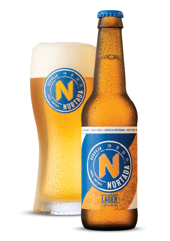
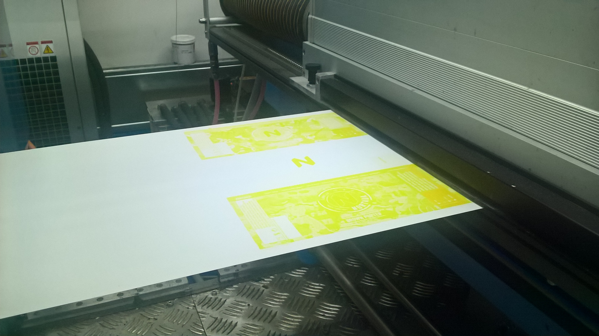
This approach gave us a wide range of extraordinary visuals that were applied to all packaging and communication materials.
BEFORE & AFTER
OLD LABELS
NEW LABELS
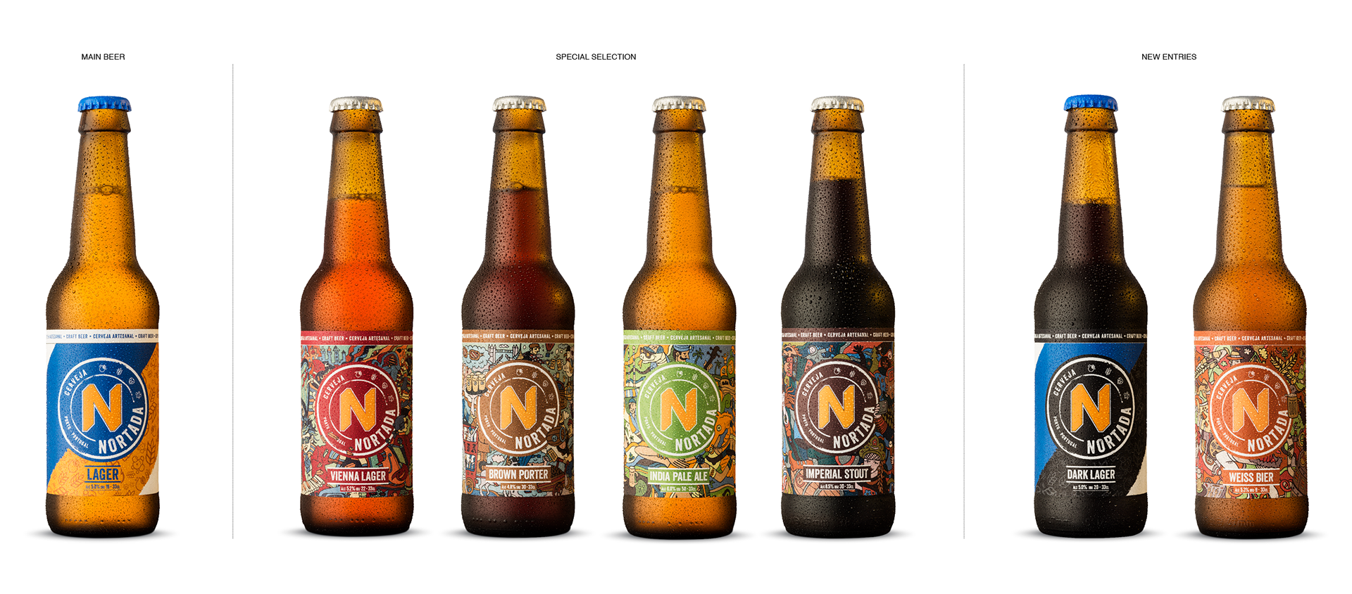
PACKSHOTS
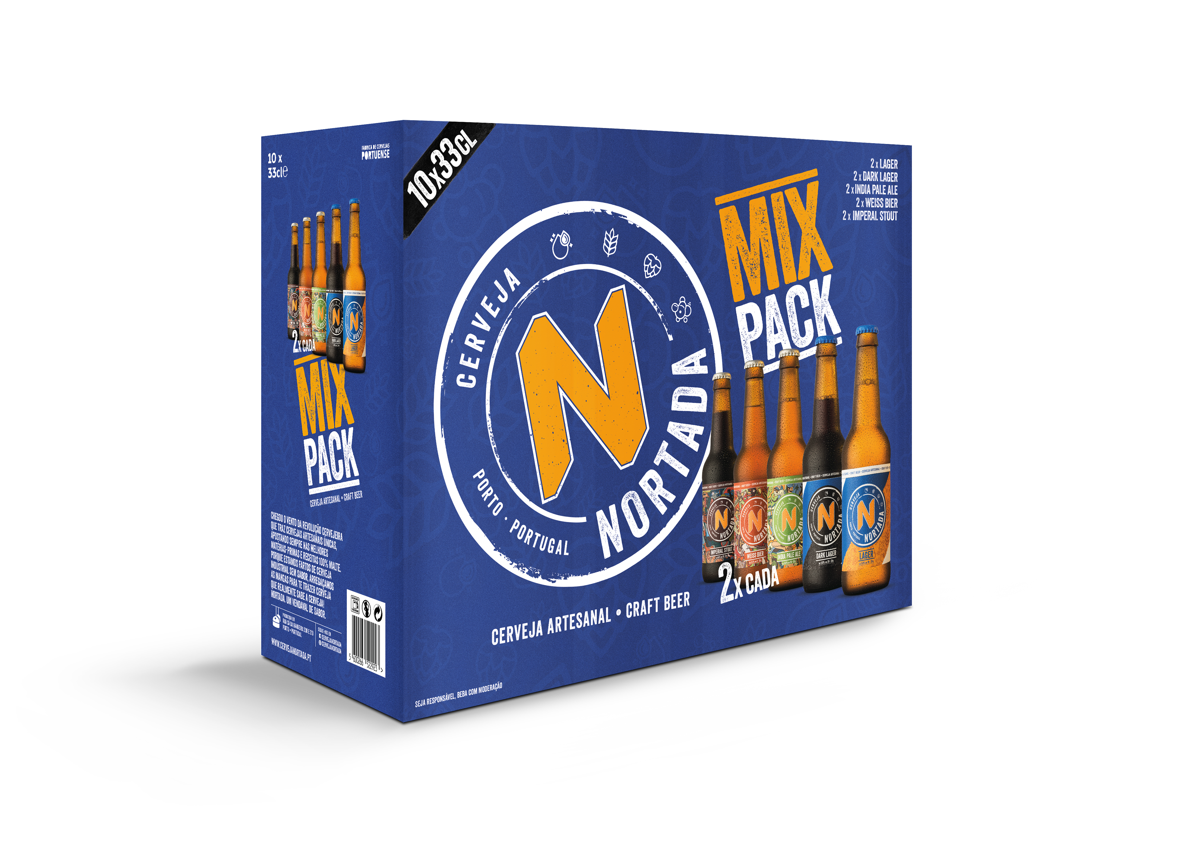
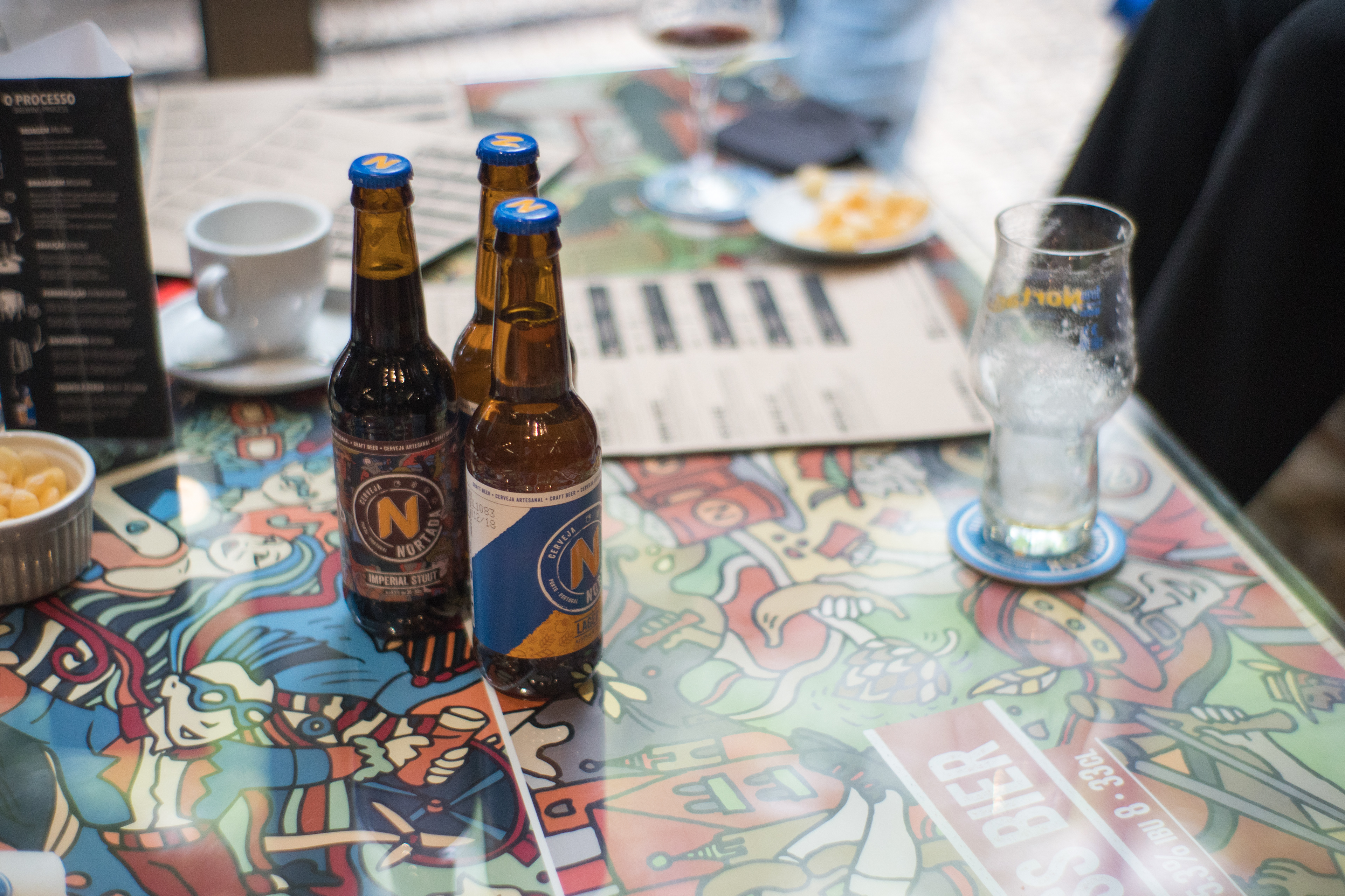
MEET THE FAMILY

PACKSHOTS - 33cl BOTTLES

PACKSHOTS - 33cl SPECIAL SELECTION
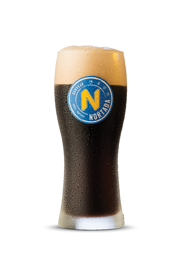
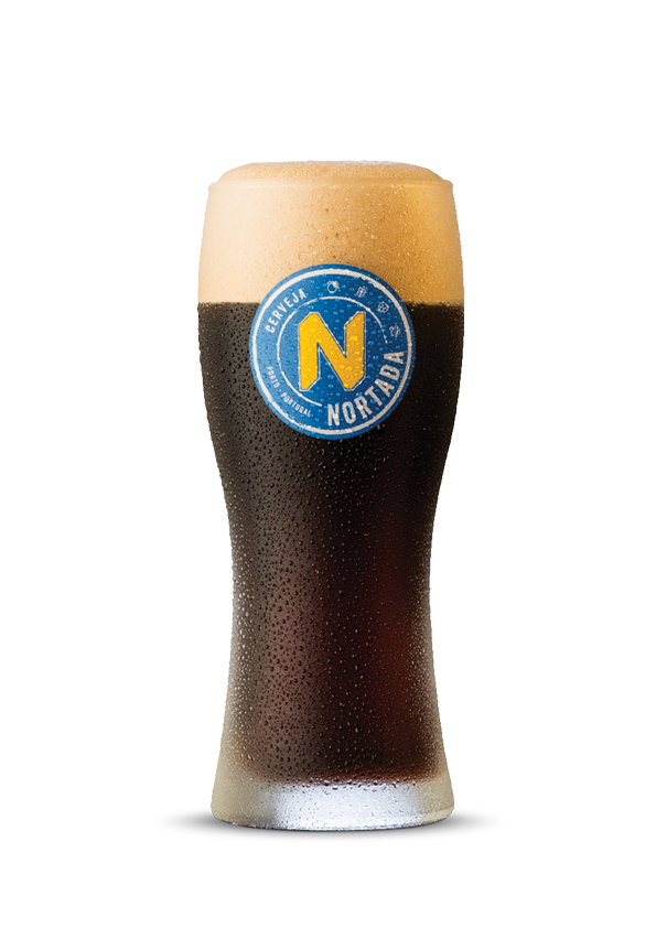
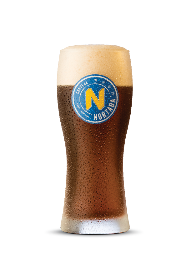
PACKSHOTS - GLASSES
KEVISUALS
POSTERS - POINT OF SALE


KEYVISUALS - PREMIUM BEERS
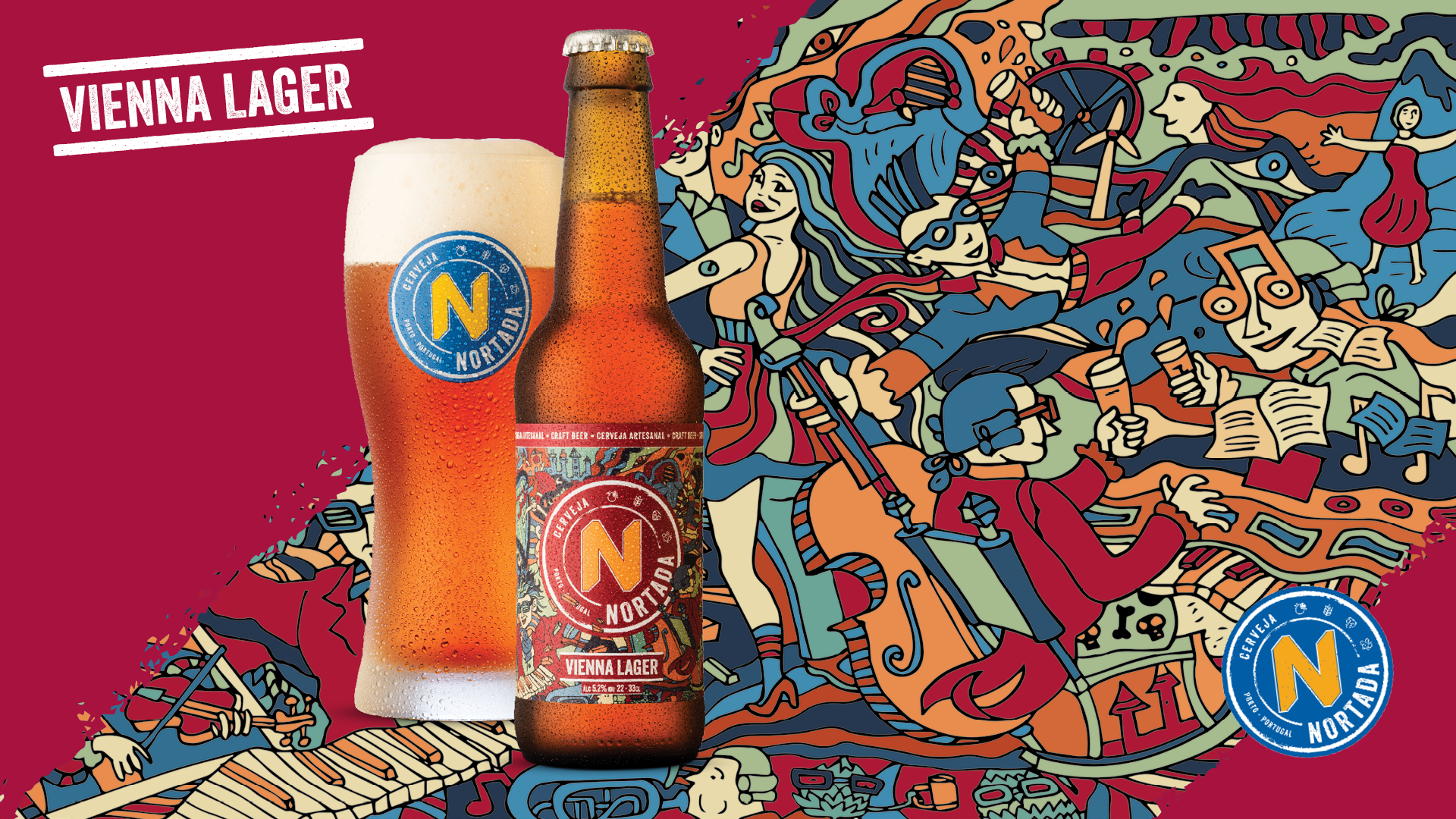
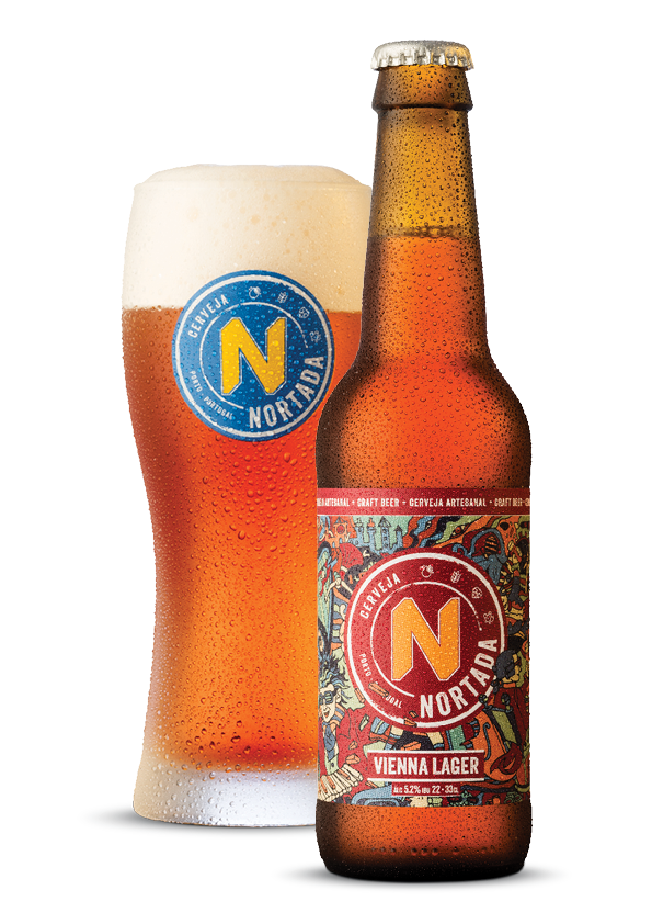
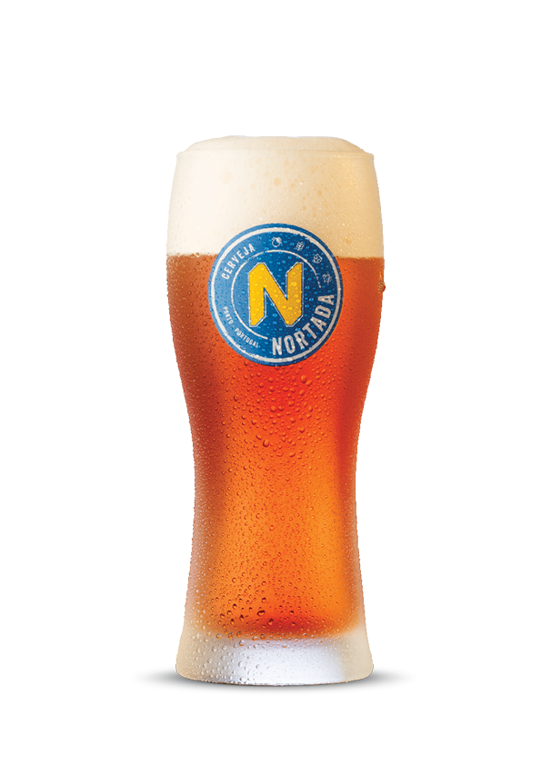
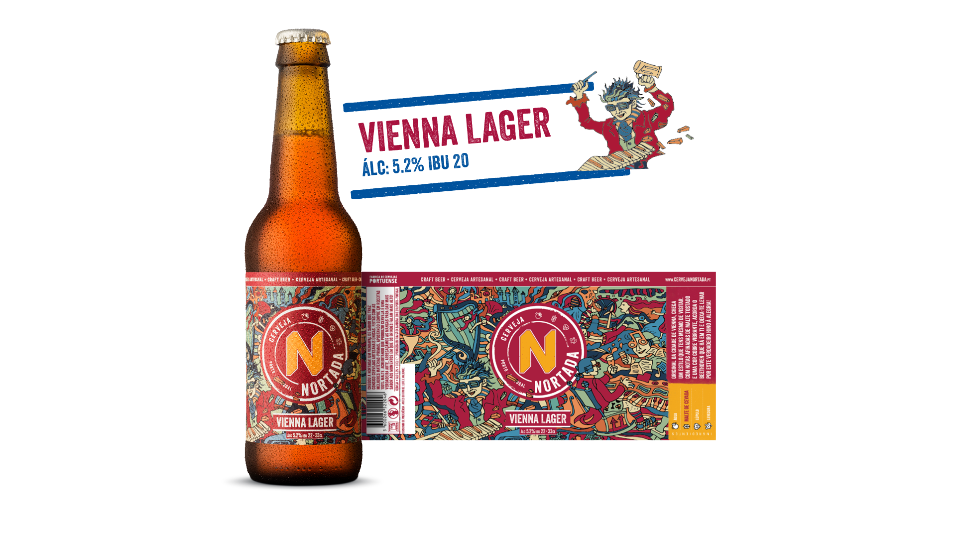
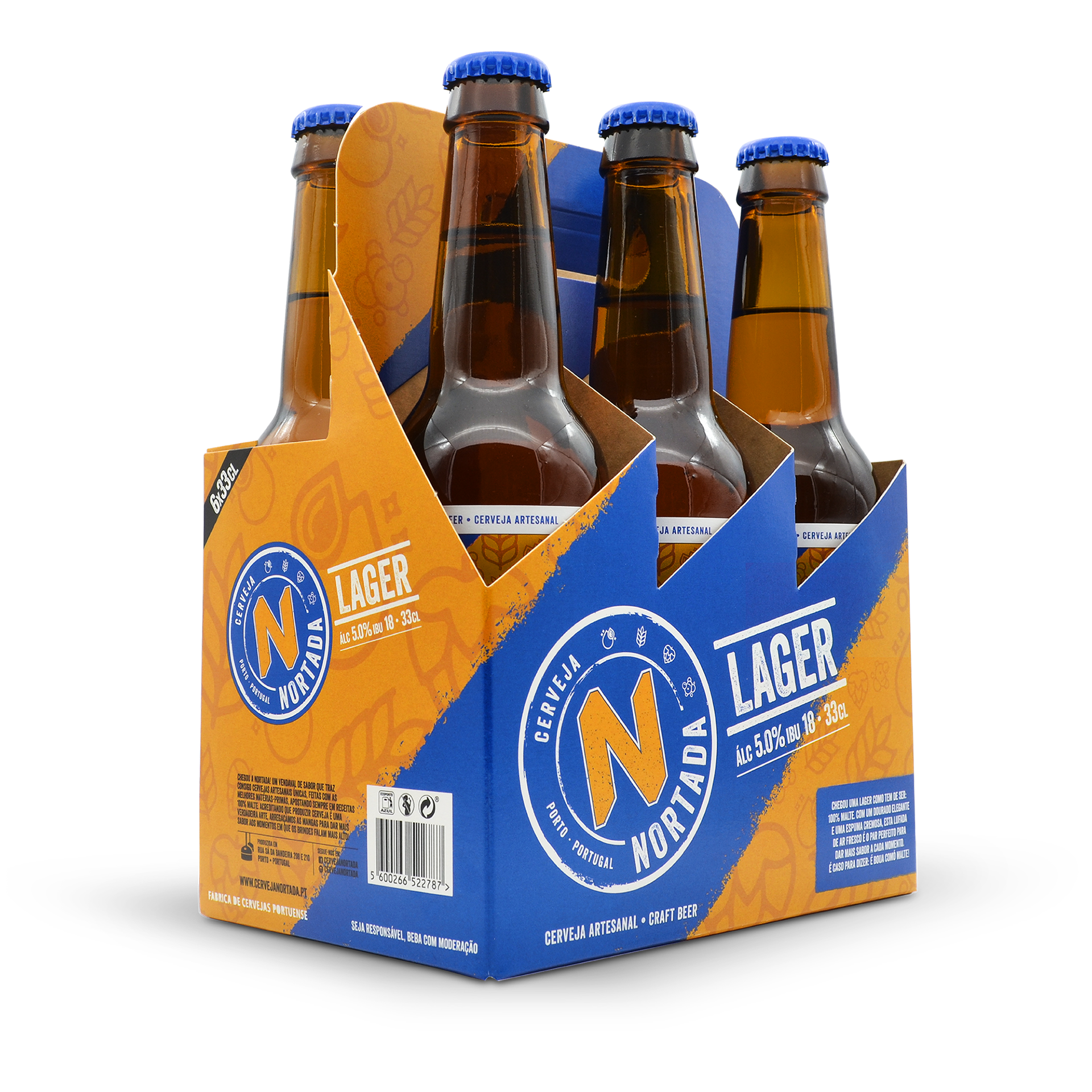
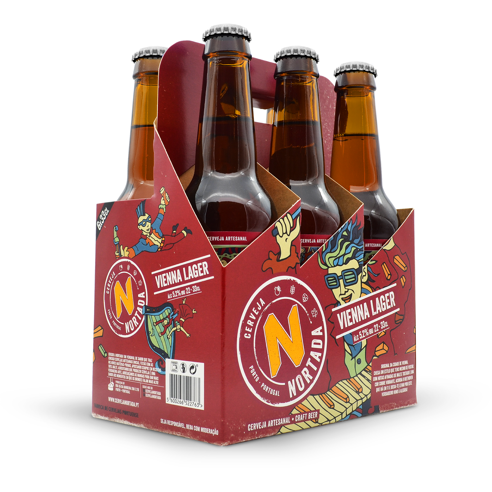
VIENNA LAGER
Original da cidade de Vienna, chega um estilo que tens mesmo de visitar.
Com notas afinadas de malte tostado e uma cor cobre vibrante, acorda o Beethoven
que há em ti e deixa-te levar por este verdadeiro hino à alegria!
EN
Originally from the city of Vienna, this is a style you really have to visit! With sharp notes of light roasted malt and a vibrant copper colour, awaken the Beethoven within you and let yourself dance to the sound of this ode to joy!
EN
Originally from the city of Vienna, this is a style you really have to visit! With sharp notes of light roasted malt and a vibrant copper colour, awaken the Beethoven within you and let yourself dance to the sound of this ode to joy!
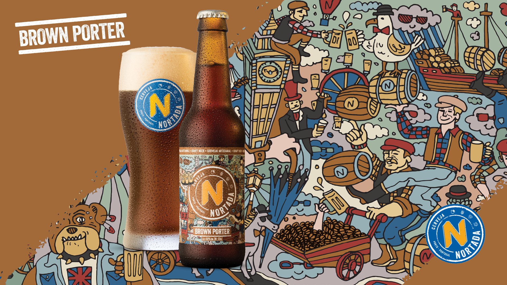
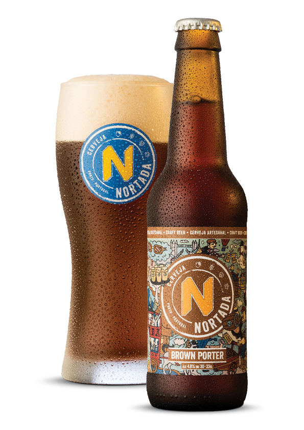
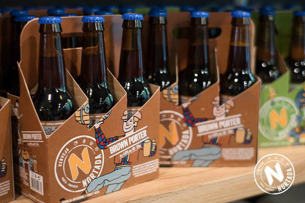
BROWN PORTER
Popularizada pelos operários nos portos de Londres, chega o combustível para mais um dia de vento em popa! Castanha escura e com notas de café, carrega o contentor e estás pronto para qualquer maré!
EN
Popularised by the London Port workers, this beer is the fuel that makes you power through your day! With a deep brown colour and subtle hints of caramel and coffee, load the containers because you’re ready to face any tide that comes your way!
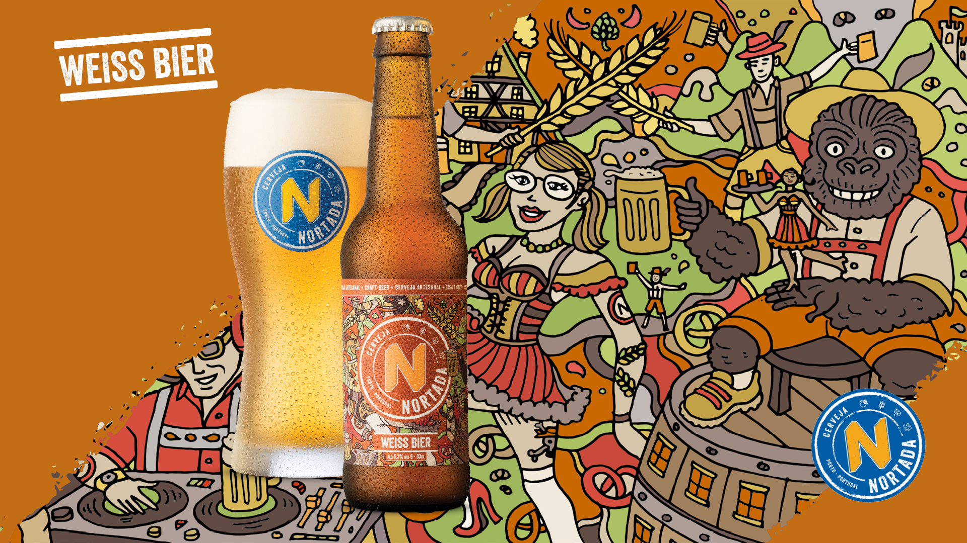
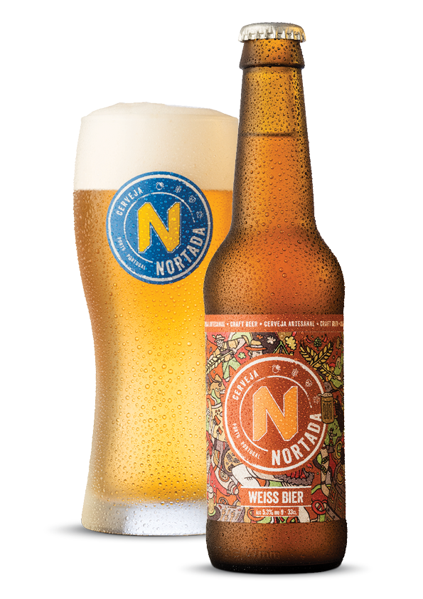
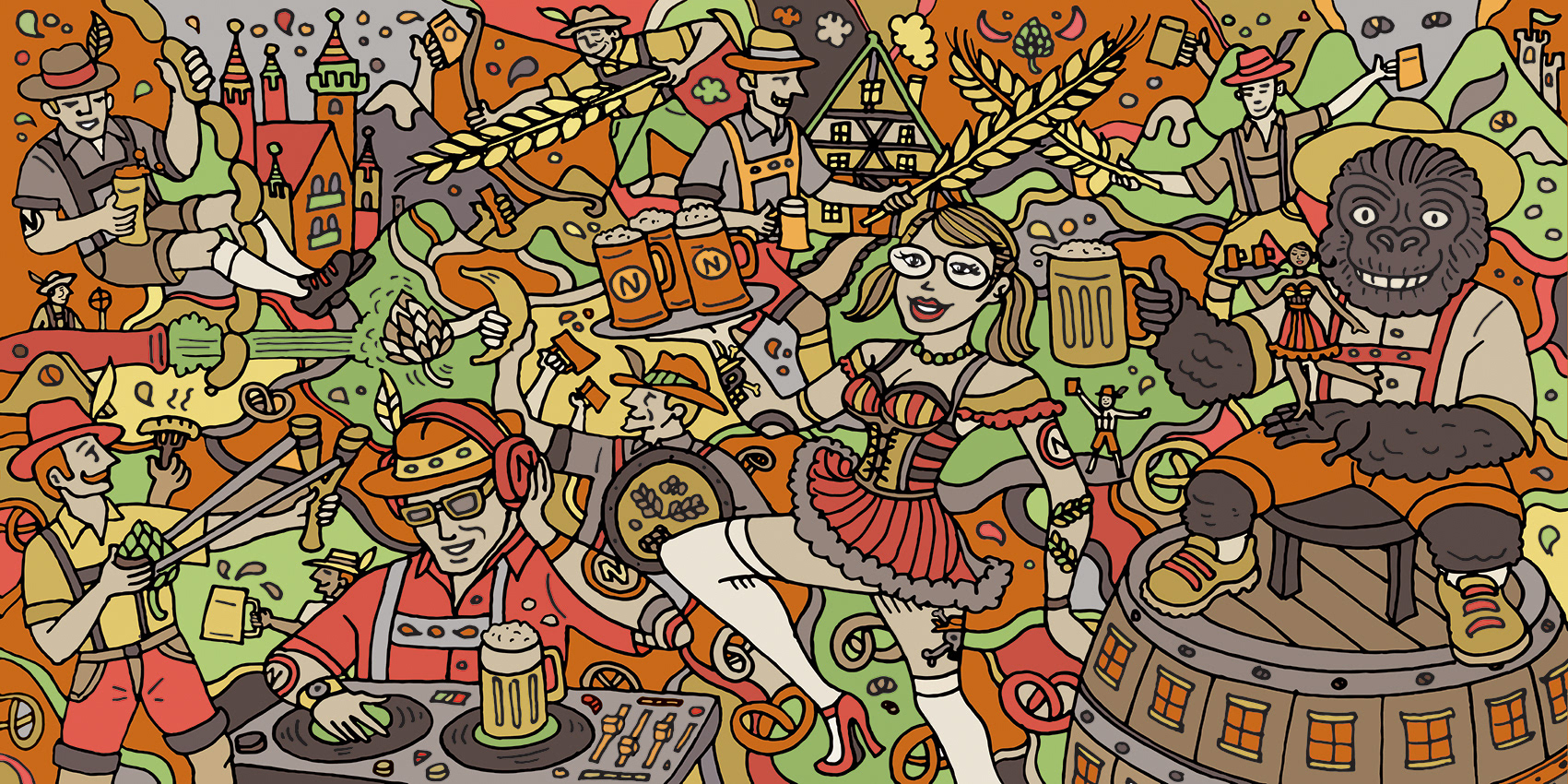
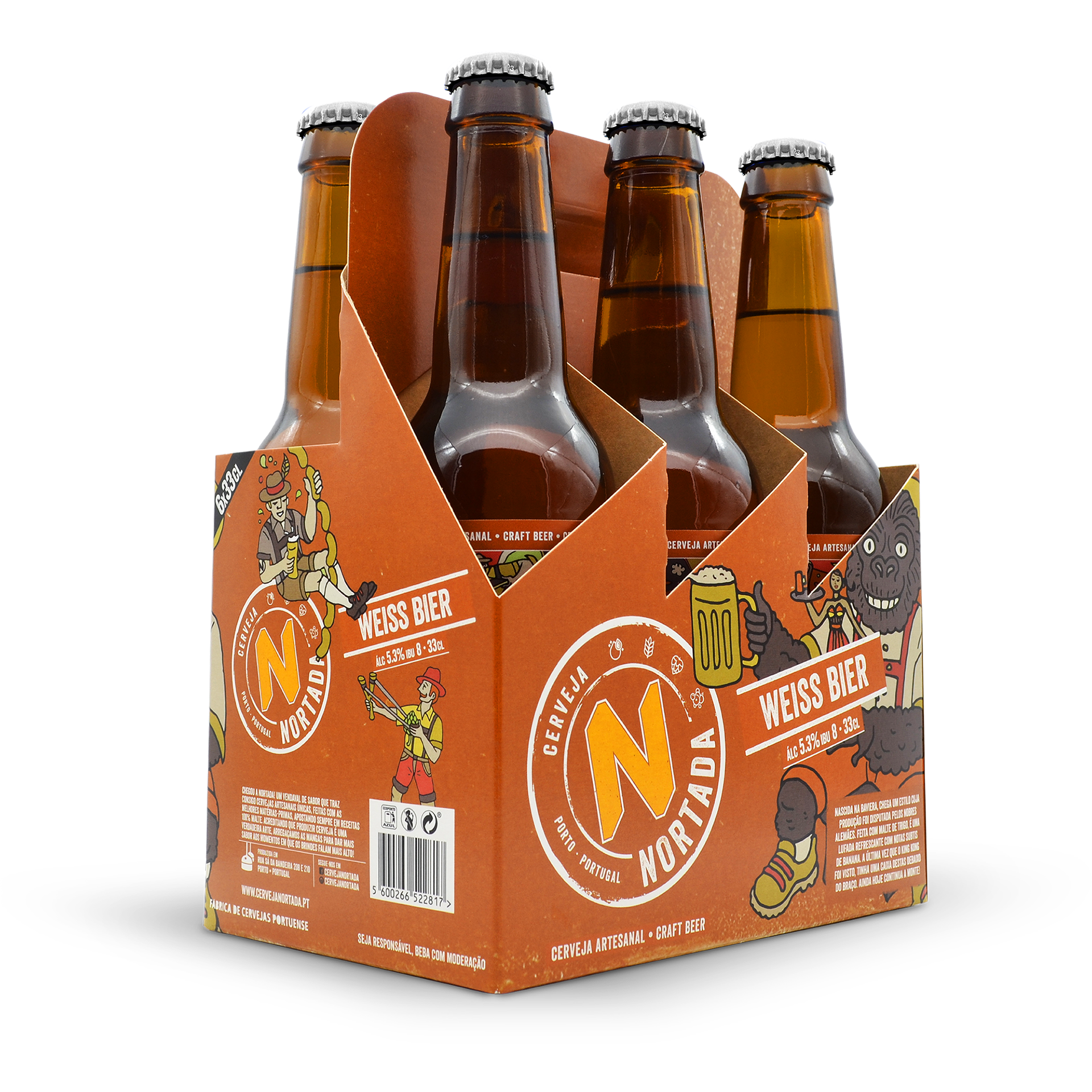
WEISS BIER
Nascida na Baviera, chega um estilo cuja produção foi disputada pelos nobres alemães. feita Com malte de trigo, é uma lufada refrescante com notas subtis de banana.
A última vez que o King Kong foi visto, tinha uma caixa destas debaixo do braço.
Ainda hoje continua a monte!
EN
Born in Bavaria, the production of this beer style was a reason for major disputes between the German Nobles. Produced with wheat malt, it is extremely refreshingly with subtle hints of banana. The last time King Kong was spotted, he had a box of this beer under his arm. He remains at large until this day!

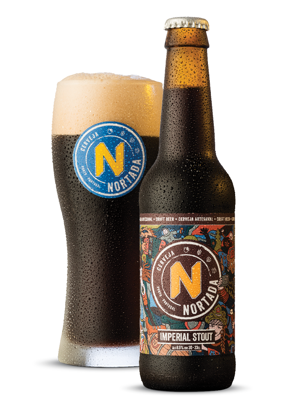
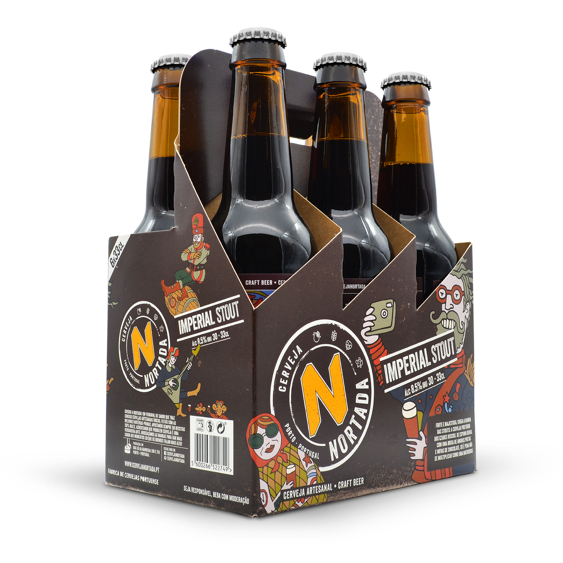
IMPERIAL STOUT
Forte e majestosa, chega a rainha das Stouts: a cerveja preferida dos Czares Russos.
De espuma densa, com uma brisa de amoras pretas e notas de chocolate, só é pena não se multiplicar como uma matrioska!
EN
Strong and majestic, this is the queen of the Stouts: the favourite beer of the Russian Czars. With a dense foam and a brise of coffee and notes of chocolate, it’s only down side is that it doesn’t multiply like Matrioska dolls!
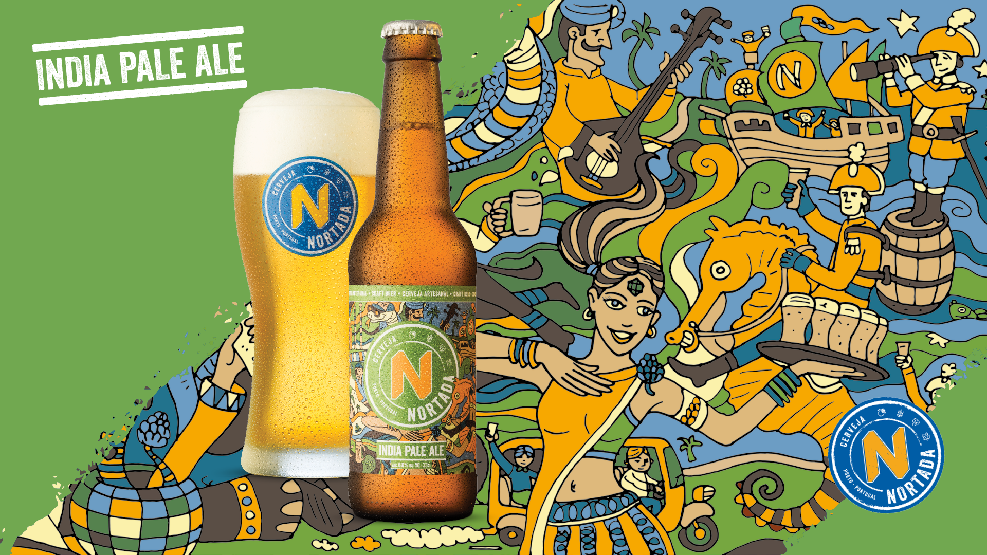
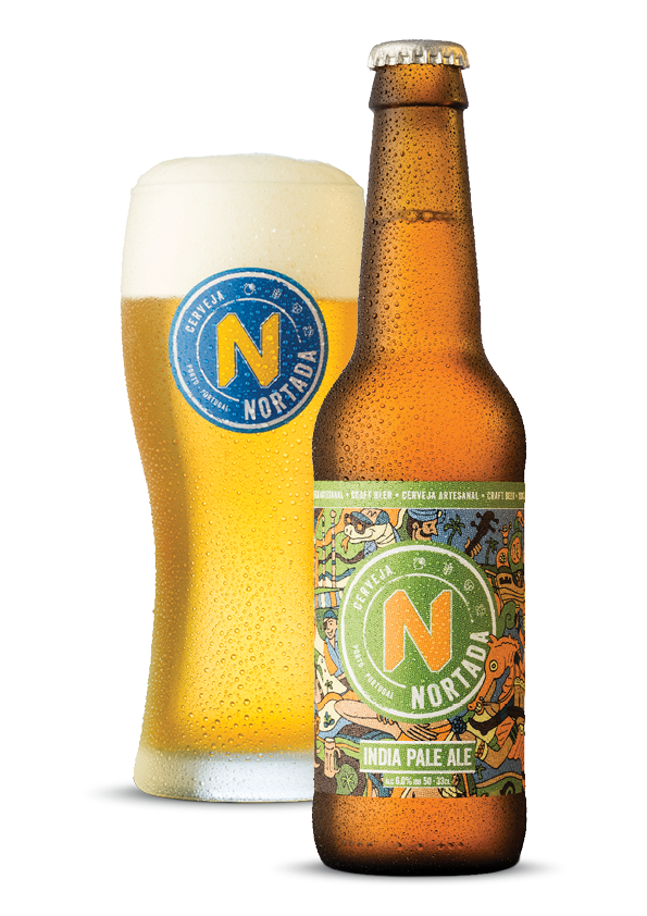
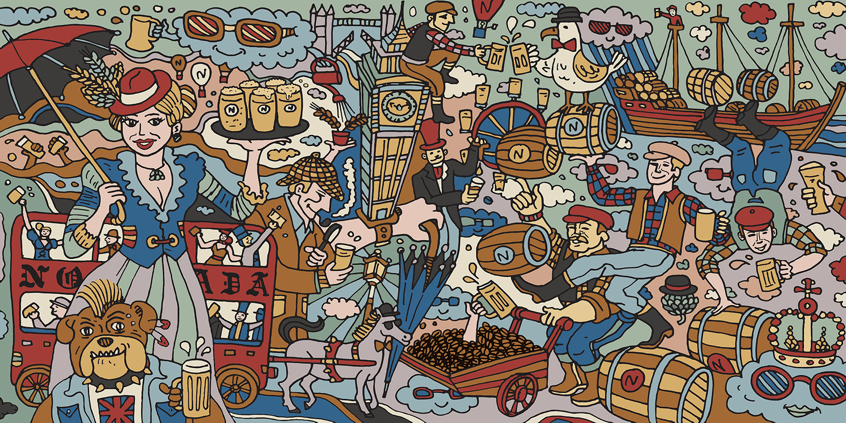
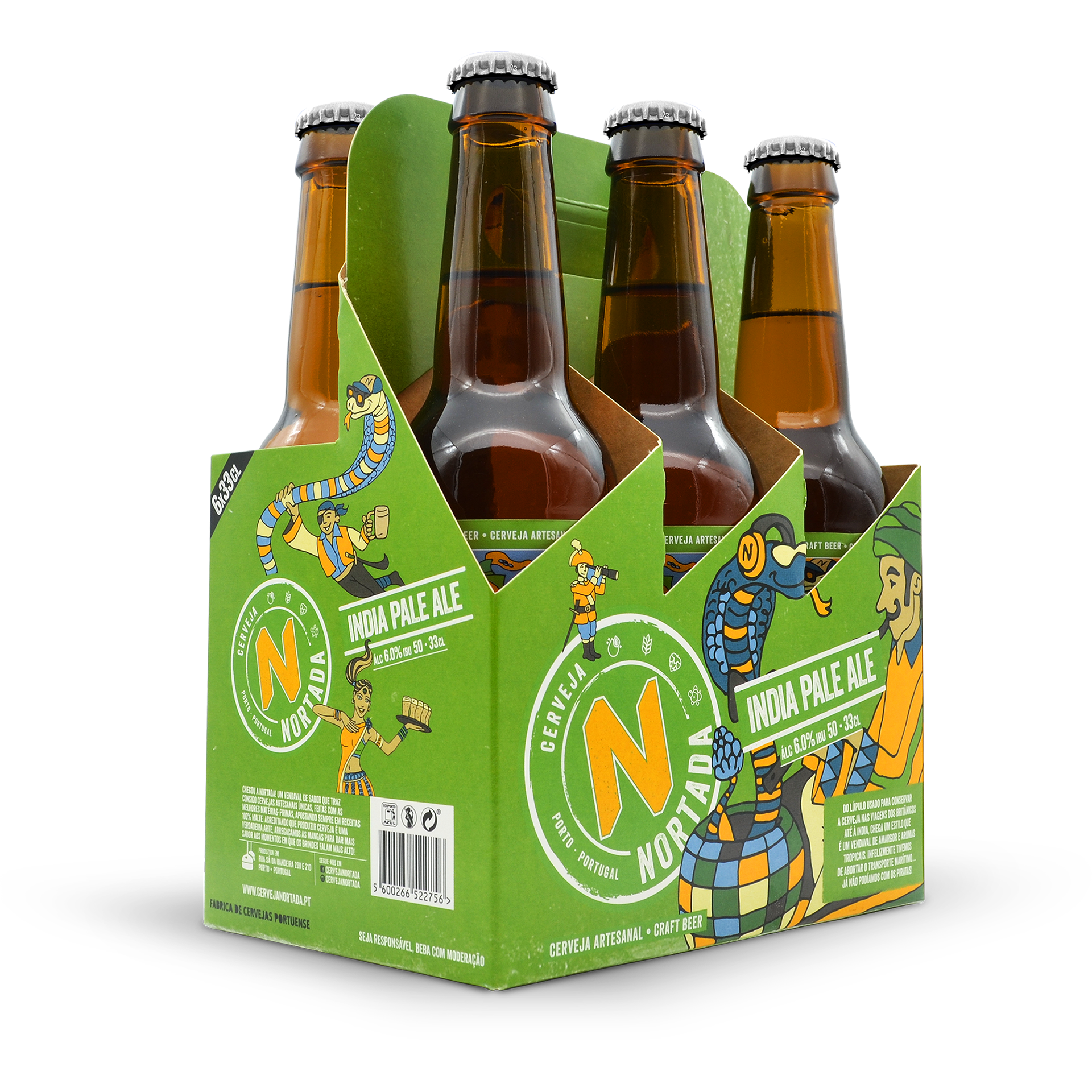
INDIA PALE ALE
Do lúpulo usado para conservar a cerveja nas viagens dos Britânicos até à India, chega um estilo que é um vendaval de amargor e aromas tropicais. Infelizmente tivemos
de abortar o transporte marítimo… já não podíamos com os Piratas!
EN
Discovered by the British from the use of hops to preserve their beer in the long trips to their Indian colonies, this style is a storm of bitterness and tropical aromas.
Unfortunately we had to abort sea transport... We couldn’t deal with the Pirates!
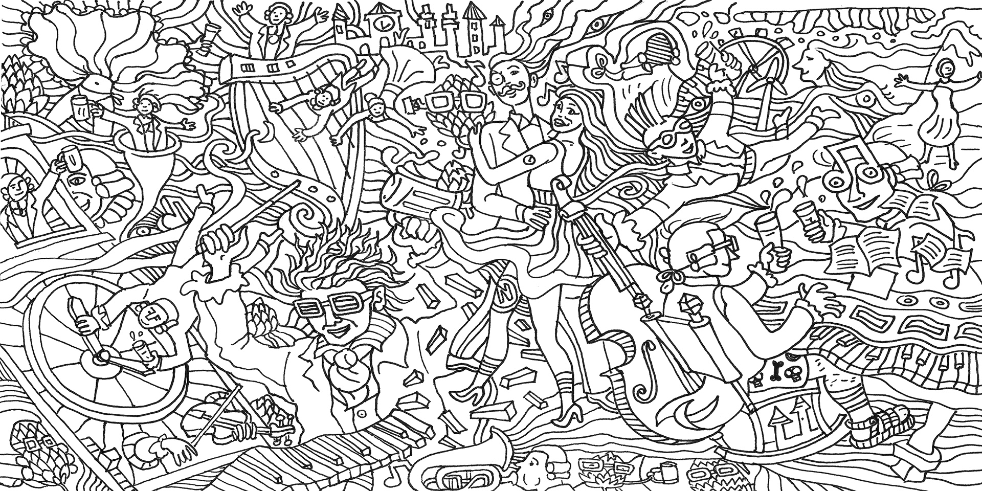
LABELS

Vienna Lager Label sketch
Vienna Lager final illustration

Brown Porter Label sketch

Brown Porter final illustration
Weiss Bier Label sketch
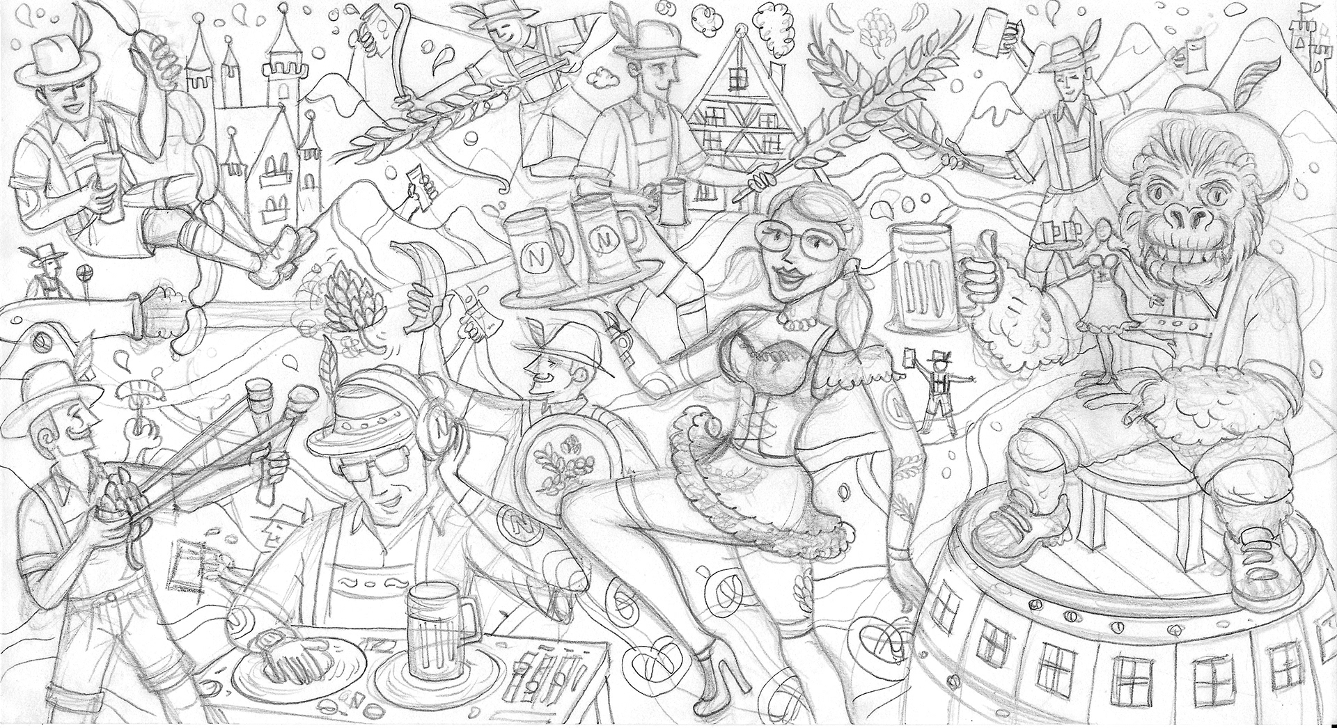
Weiss Bier final illustration
Inda Pale Ale Label sketch

India Pale Ale final illustration

Imperial Sout label sketch
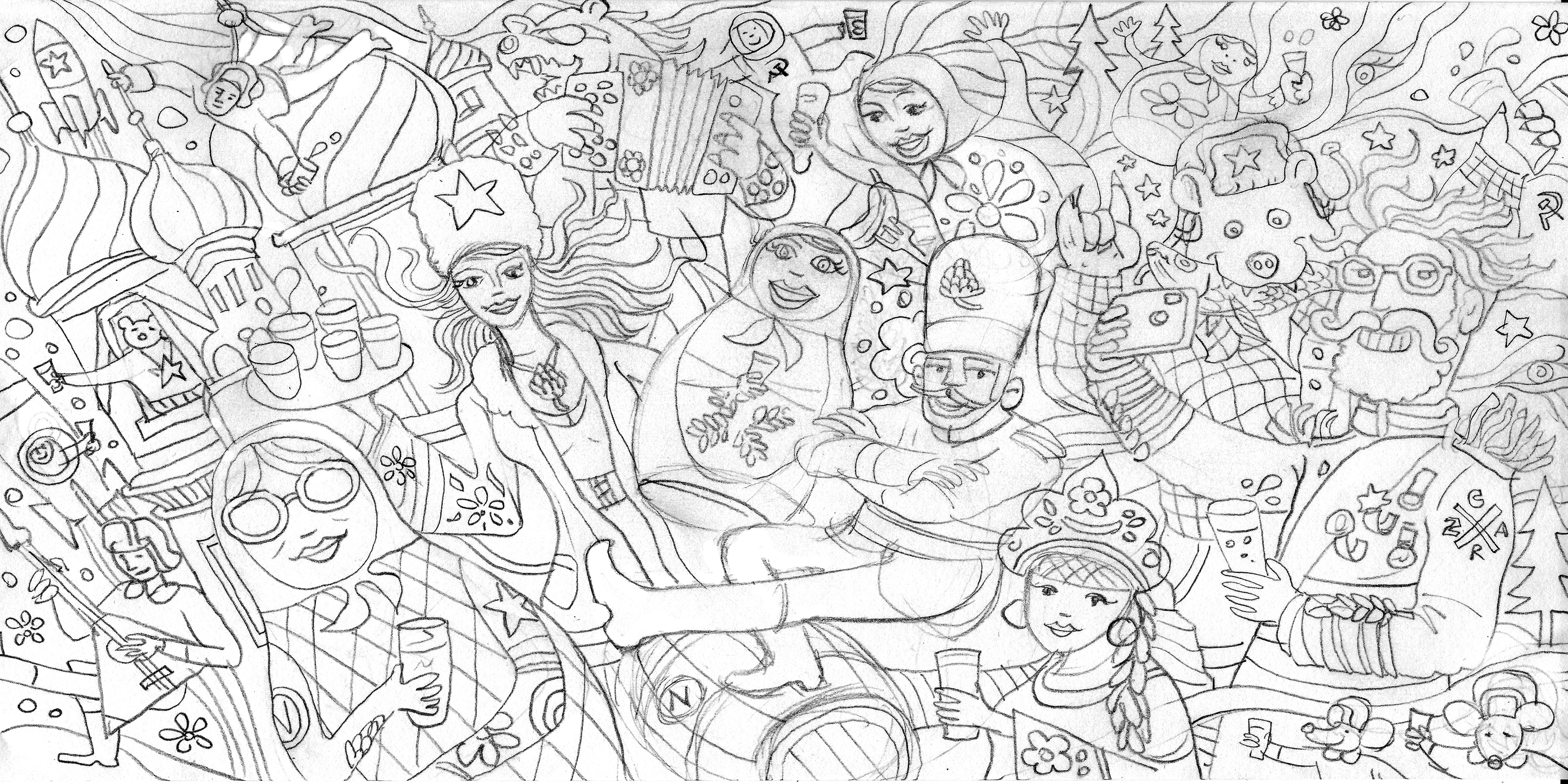
Imperial Sout final illustration

SIXPACKS


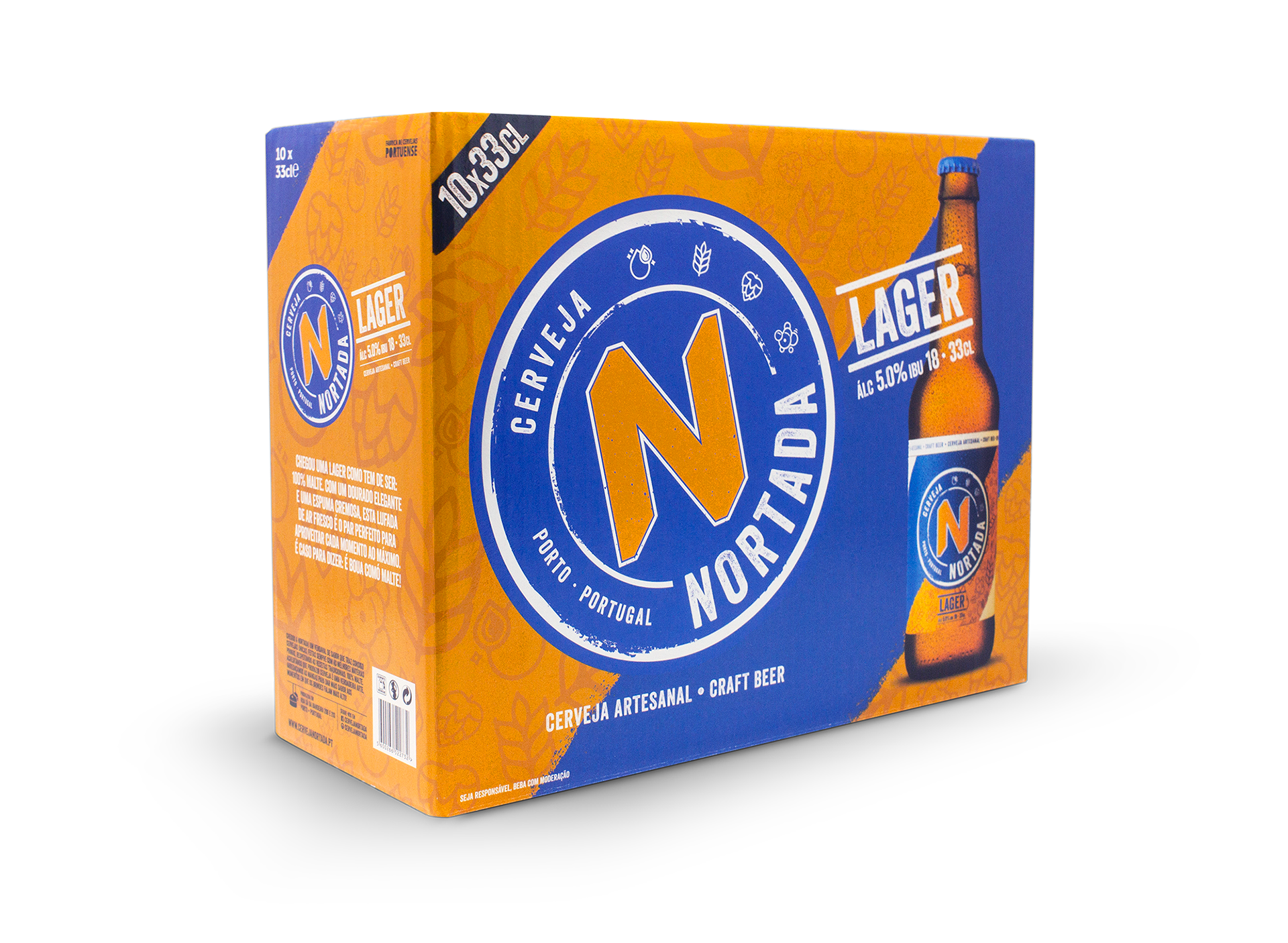
TENPACKS


CREDITS
BRAND MANAGER
DIOGO GUERNER
DESIGN
PEDRO LIMA
ILLUSTRATION
JOÃO MARTINS
COPY
AFONSO COSTA
BRAND MANAGER
DIOGO GUERNER
DESIGN
PEDRO LIMA
ILLUSTRATION
JOÃO MARTINS
COPY
AFONSO COSTA
PACKSHOTS
NUMO.PT
NUMO.PT